|
I was inspired by rud.is's post: Putting It All Together So, I begin to think about putting the charts, line chart and "dumbbell"chart into Tableau. 1. Load the data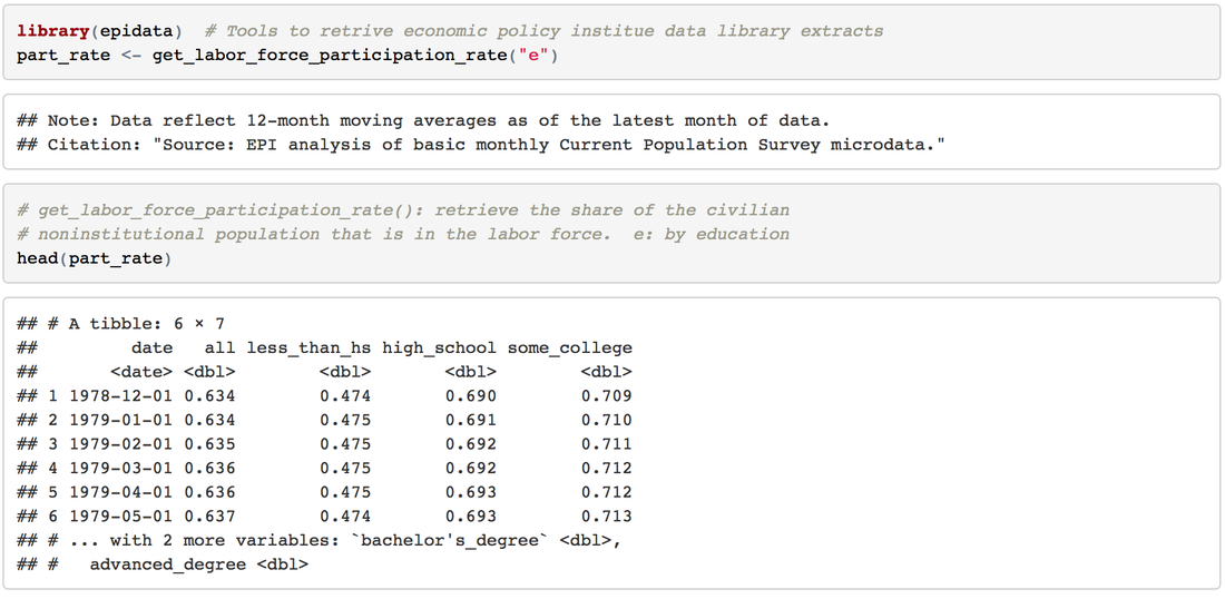 2. Transform to Tableau friendly datasetTo make it easily shown in Tableau, we need to "flatten" the dataset 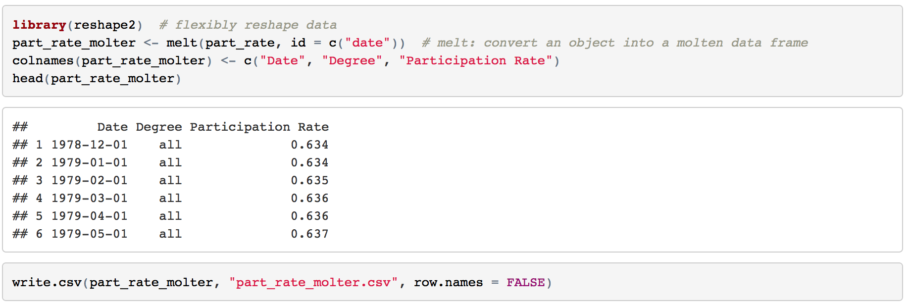 3. Line chartsIt's pretty easy to make some line charts in Tableau. Column: Day(Date) Row: AVG(Participation Rate) Color: Degree Sheet Name: US Labor Force Participation Rate y-axis: title: Participation Rate; format number into percentage x-axis: remove title 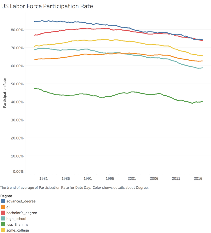 4. "Dumbbell" chart, also called DNA chartDNA chart is a little bit difficult, so let's do it step by step: Drag Degree to the rows -> Drag Participation Rate to columns -> Change SUM to MIN: 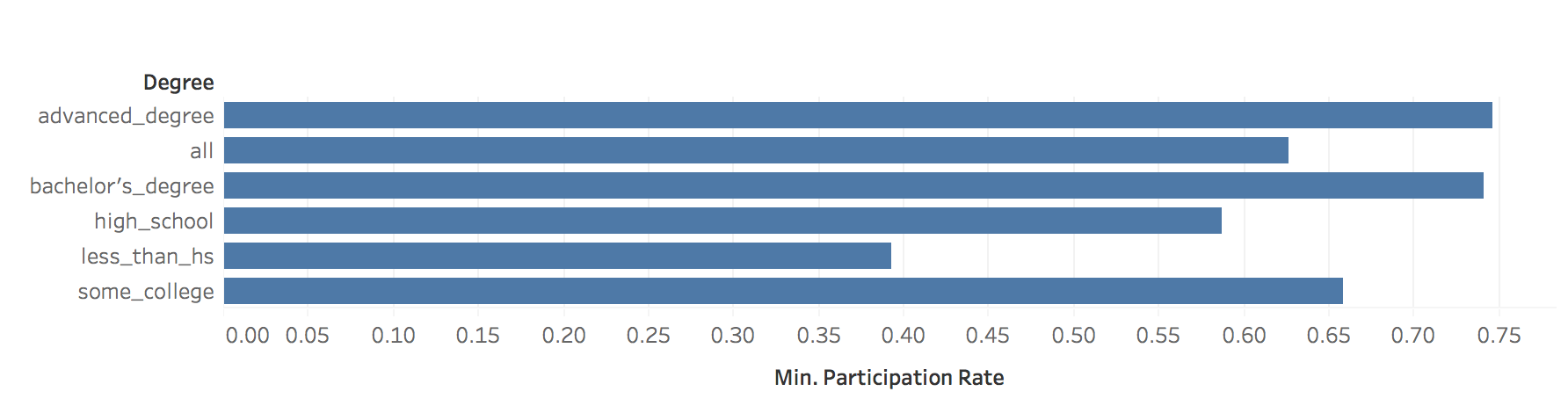 Drag Participation Rate to x-axis and using MAX -> Drag Measure Names on color -> Change the Mark Automatic to Circle: 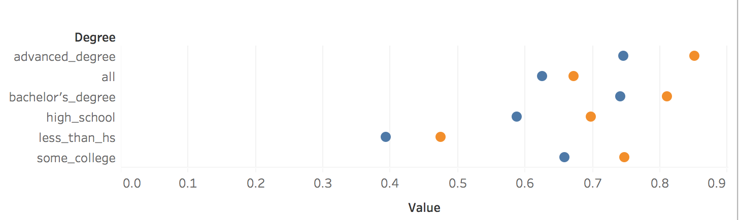 Drag Measure Values on Column again -> Change to Dual Axis -> Synchronize x axis -> Go to second Measure Value Panel, change mark to line 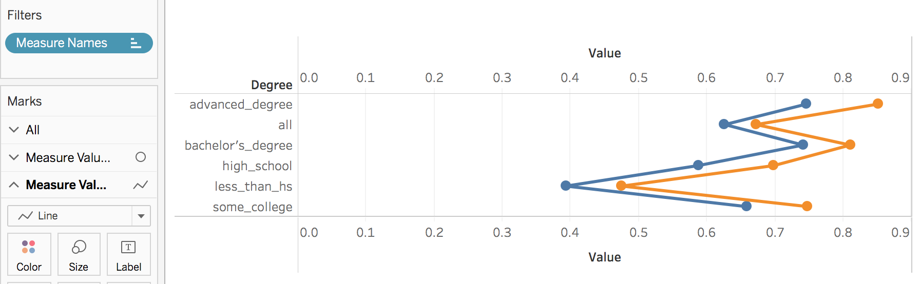 Move Measure Name to the path: 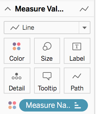 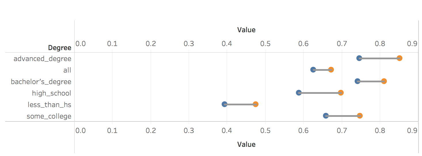 To make it similar with the blog post in rud.is: Edit the color: 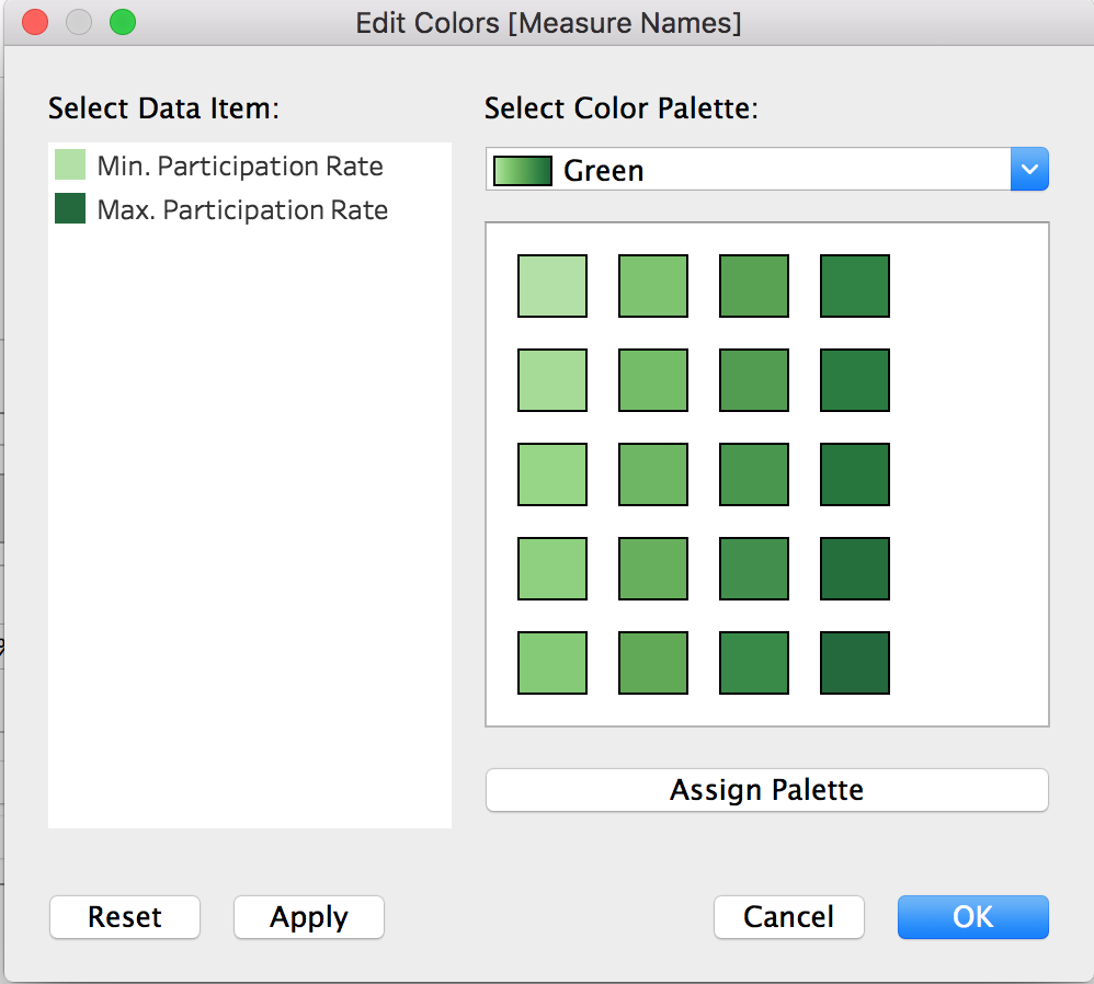 Change Line size and edit color: 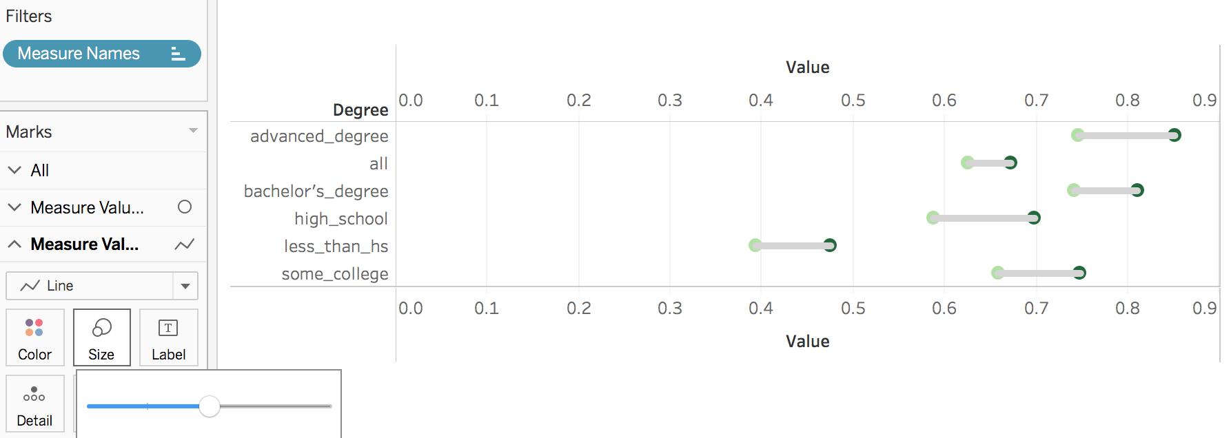 Then do some minor changes: 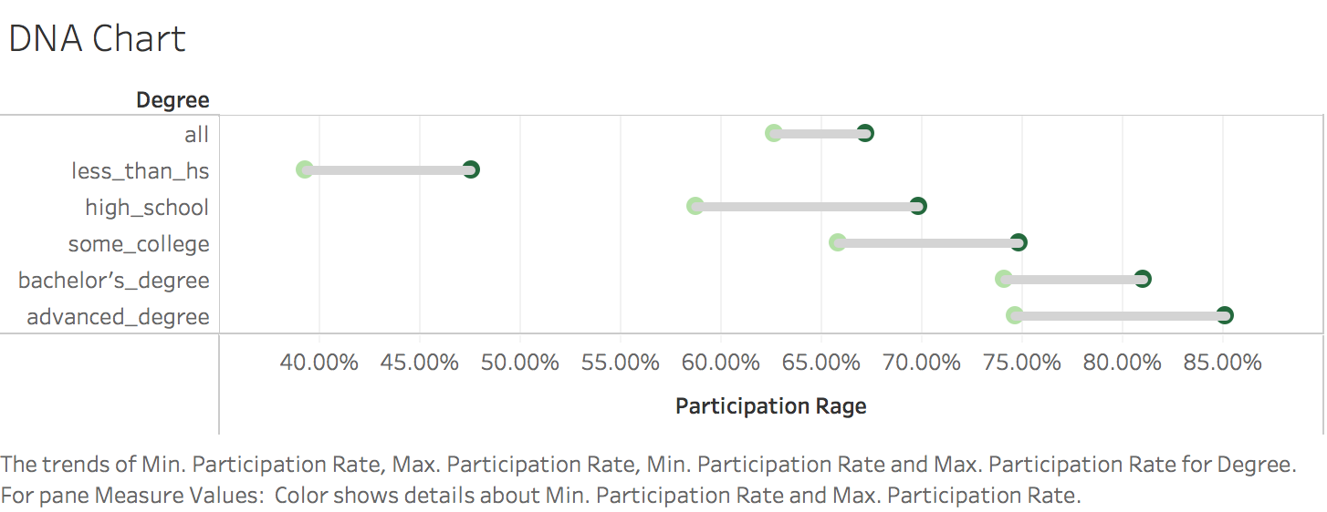 It's done! To view full dashboard:
https://public.tableau.com/views/U_S_LaborForceParticipationRate/Dashboard1?:embed=y&:display_count=yes
0 Comments
1. Get the dataThis breast cancer databases was obtained from the University of Wisconsin Hospitals, Madison from Dr. William H. Wolberg.: https://archive.ics.uci.edu/ml/machine-learning-databases/breast-cancer-wisconsin/breast-cancer-wisconsin.data Totally, there are 10 attributes in this dataset:
2. Variable IdentificationTarget Variable: Cancer Class Predictor Variables: other attributes For this case, all the predictor variables can be treated as numeric variable, because, essentially, these variables were numeric meaningfully and then categorized to some degree. 3. Univariate AnalysisAt this stage, we explore variables one by one with histograms. Using One dashboard: 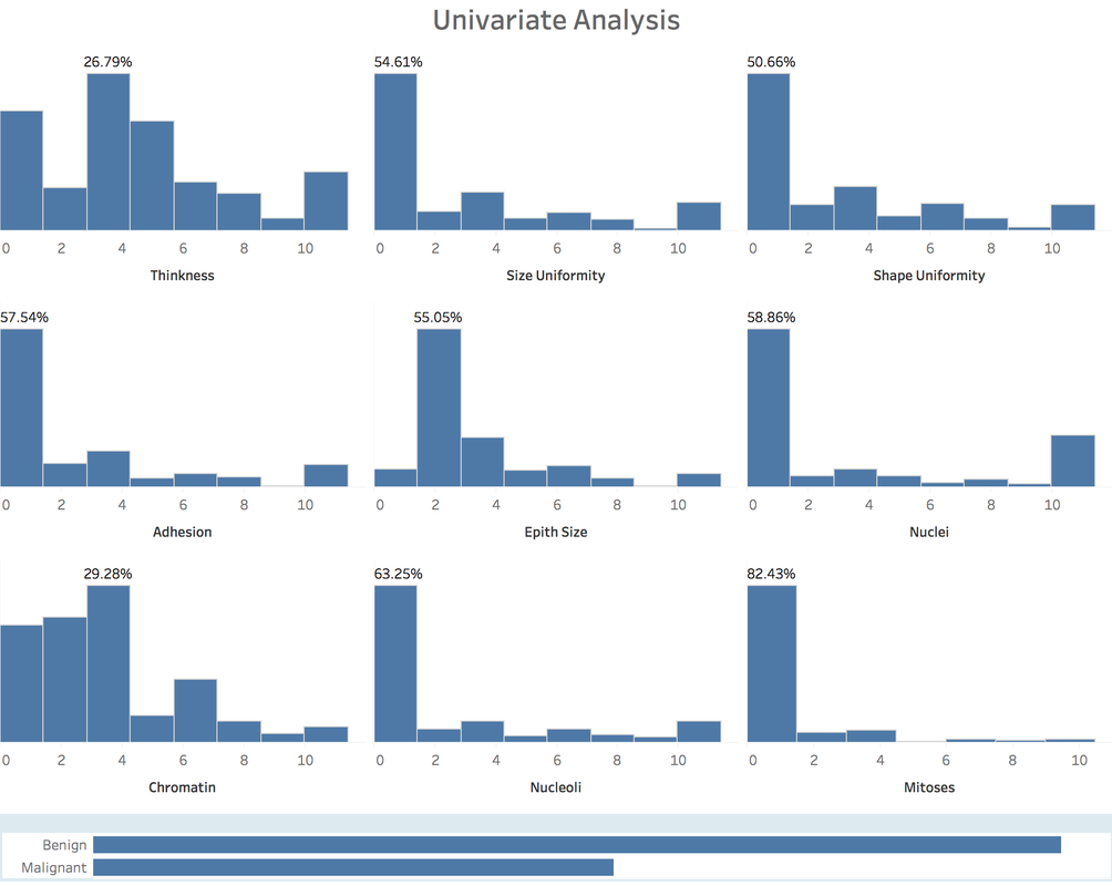 4. Bi-variate AnalysisIn Tableau, it's easy and quick to add a new 'element', a dimension into the Univariate Analysis Dashboard: 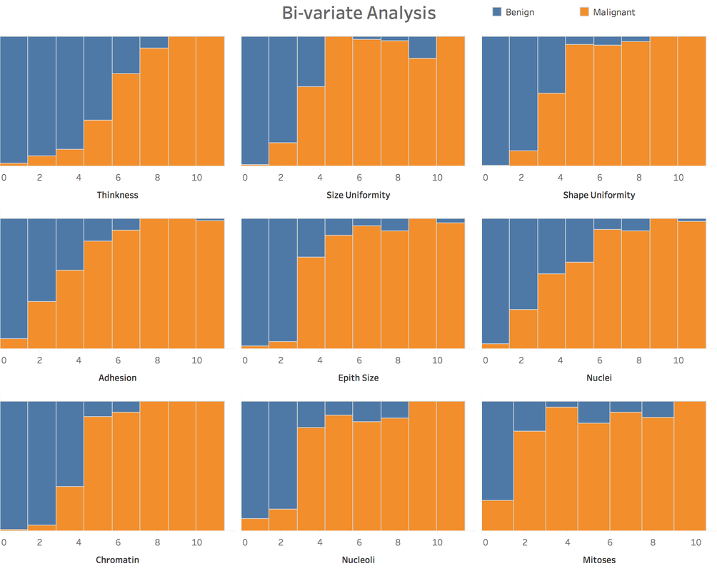 Generally speaking, from the degree 3 -4 of each attributes, the percentage of malignant cancer increases much a lot, sometimes hit the 100% line aggressively. 5. Classification PredictionClearly, it's a classification problem. Our goal is to predict whether a tumor is benign or malignant. I will using R to do this task and import the prediction result into Tableau. 5.1 Let's begin with KNN.Create 10 groups -> 10-fold cross validation -> calculate the confusion matrix -> calculate accuracy, precision, recall and f-score. 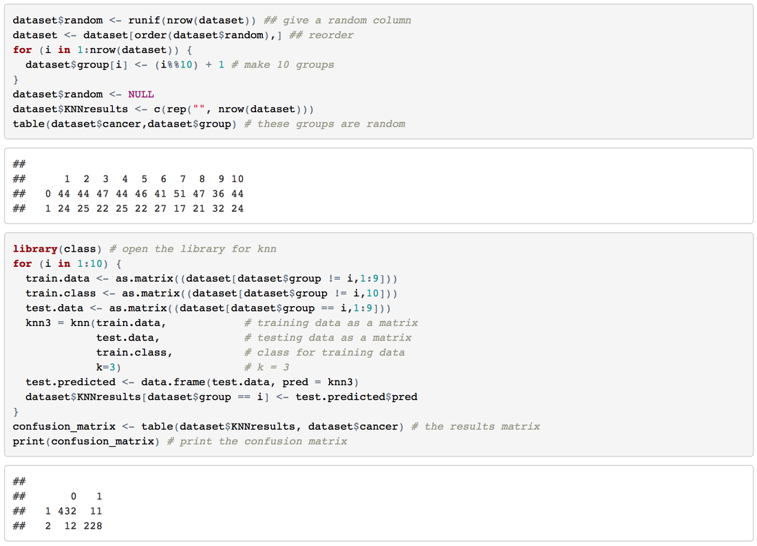 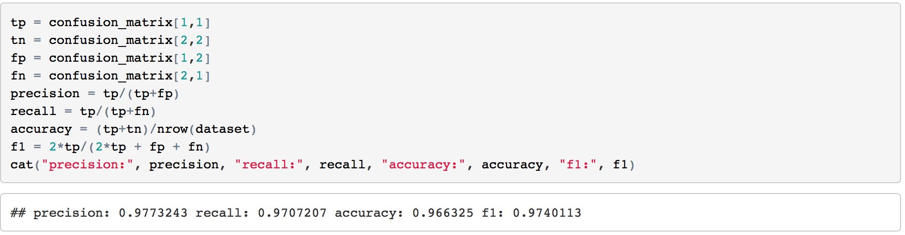 This result has been pretty perfect. 5.2 Try one more: Naive Bayes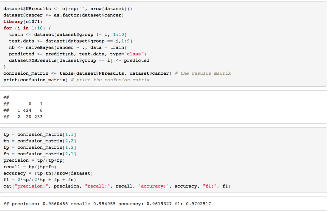 6. Take Away
Check the full dashboards here:
https://public.tableau.com/profile/jiawen.qi#!/vizhome/BreastCancer_1/BreastCancerDataset View this post on RPubs: rpubs.com/JiawenQi/GridSearchIris View this post on Github: github.com/JiawenQi98/KeepLearningR/blob/master/Grid%20Search%20of%20Iris%20Dataset.Rmd IntroductionOn Dec 10th, Simon Jackson blogged a new article about Grid Search in the tidyverse: https://drsimonj.svbtle.com/grid-search-in-the-tidyverse As a beginner in this field, Grid Search is a new term for me.
Decision Tree Example of IrisIris dataset is very famous and predictable. Let’s predict the Species by other four features 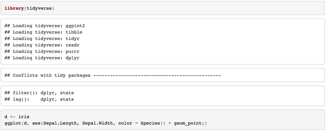 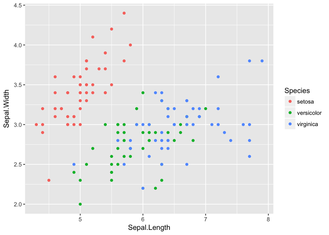  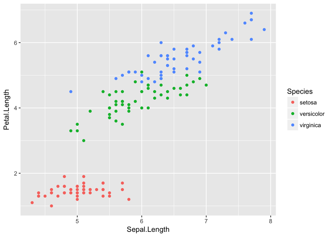    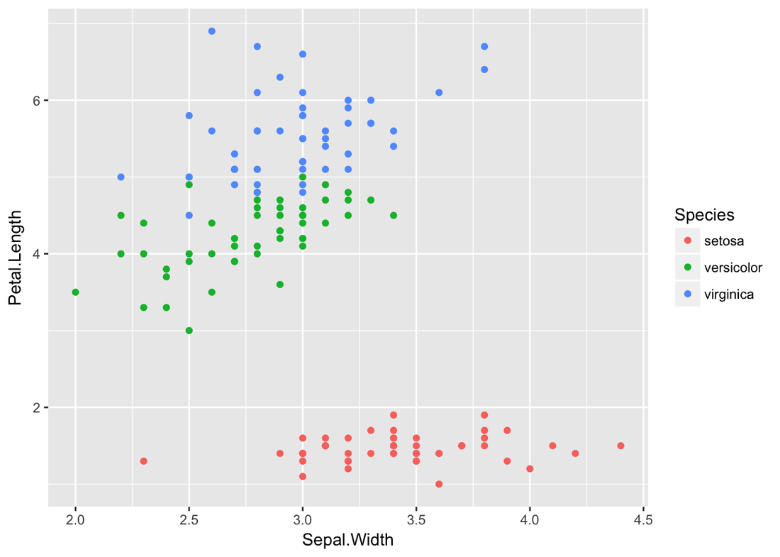  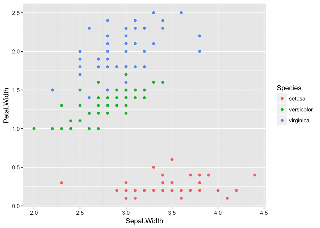  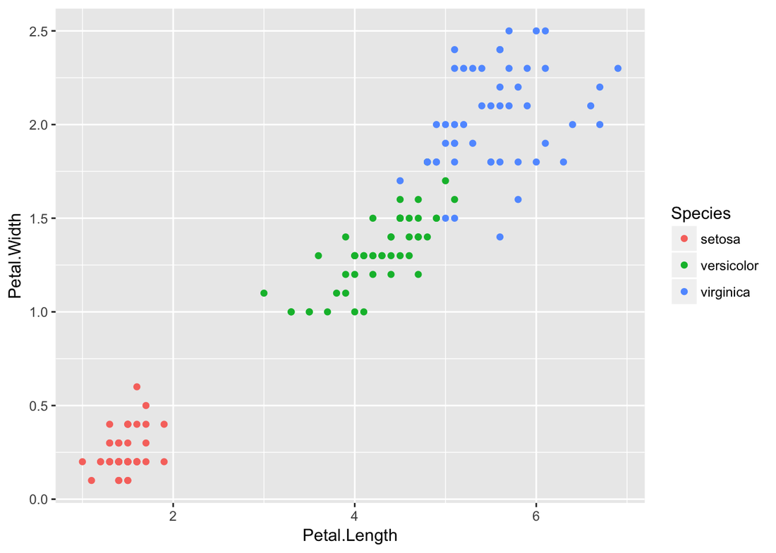
Let’s do a decision tree. 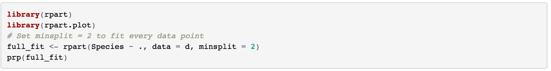 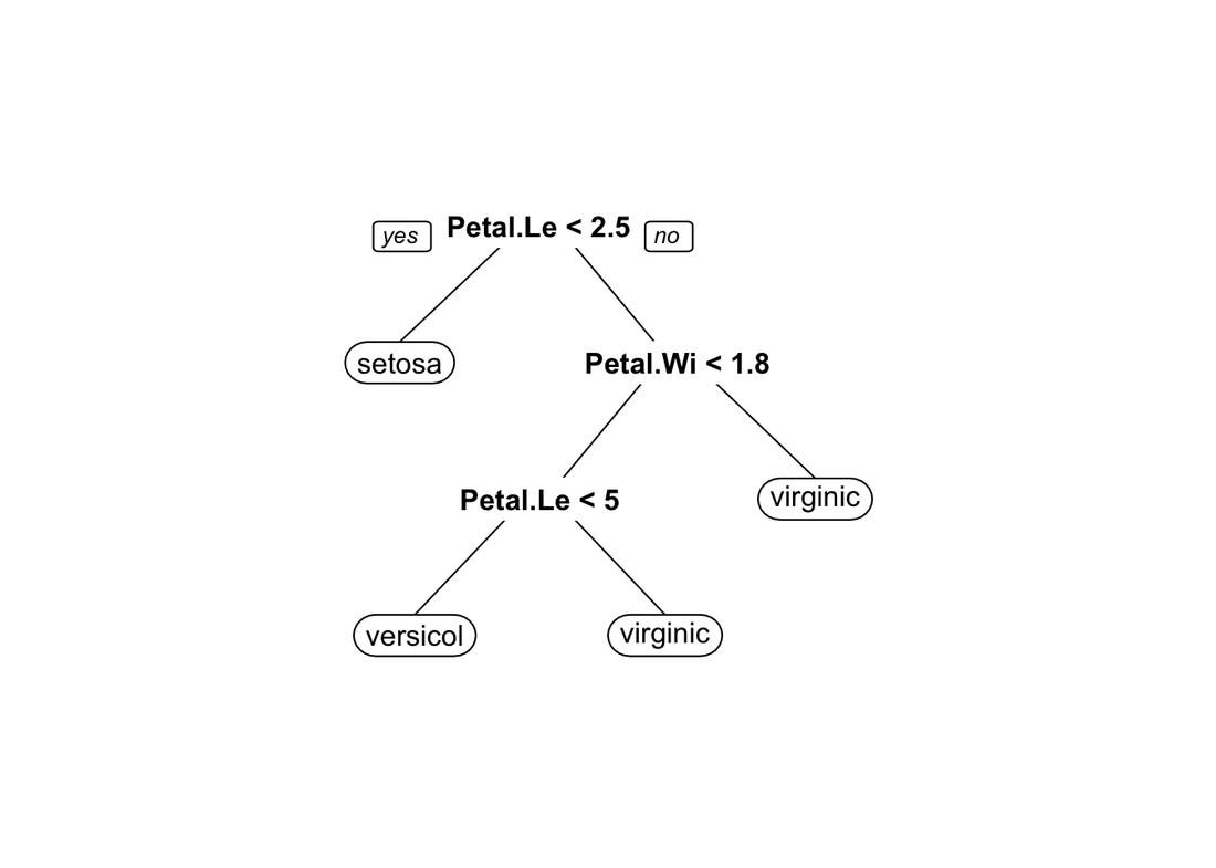
Split Training and Testing80% training, and 20% testing. 
Create the GridDefine hyperparameter combinations: (you can try different value for minsplit and maxdepth) 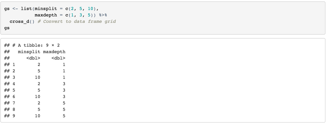
Create a Model FunctionCreate a function to go through our grid search hyperparameter combinations and modeling easily. 
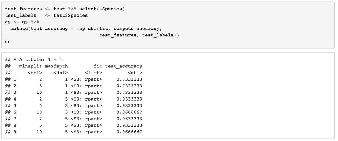
Fit the ModelsIterate down the values and fit our models. 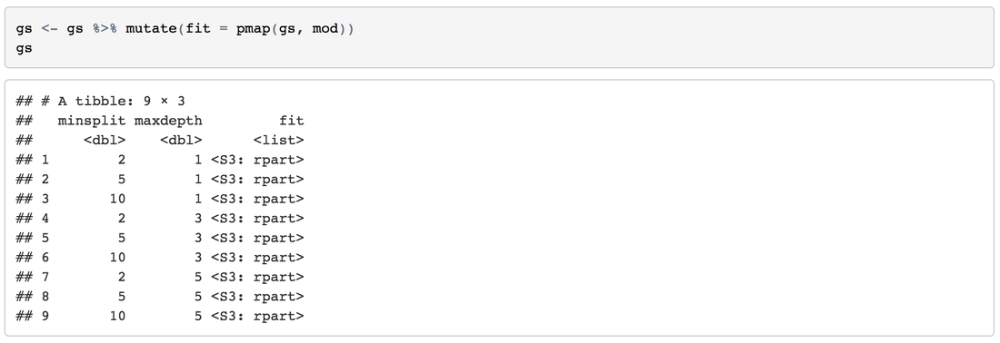
Obtain Accuracy Create a function to get accuracy easily: 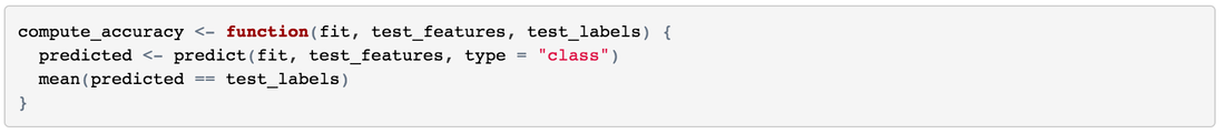
Arrange ResultsSort results by high-accuracy, more-minsplit and less-maxdepth: 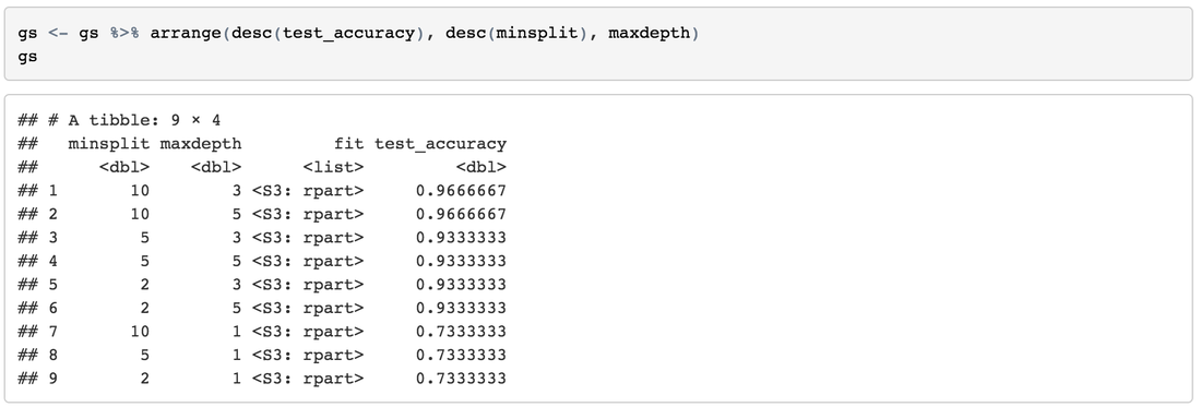
Take Away
It's the season of holidays. The gift from Tableau Public is a bunch of free and interesting datasets. Merry Vizmas! Follow These Tableau-Themed Advent Calendars: https://public.tableau.com/en-us/s/blog/2016/12/merry-vizmas-follow-these-tableau-themed-advent-calendars The dataset for Dec 1st is Global Heights. The heights in this dataset is the mean height at age 18 for a country by sex.
1. Import Data Into TableauThe format of the data is xlsx with size of 2.2 MB. Click Excel in the Connect Panel, locate to Global Heights data, and Open. 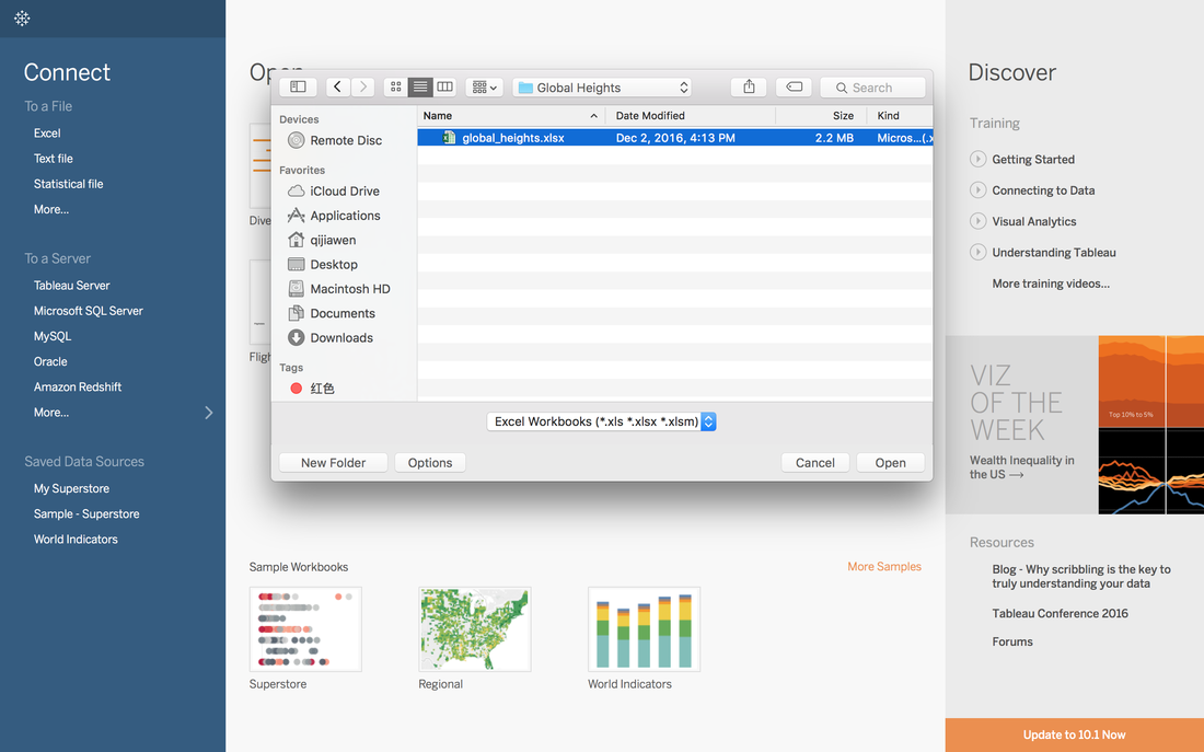 2. Quick View with R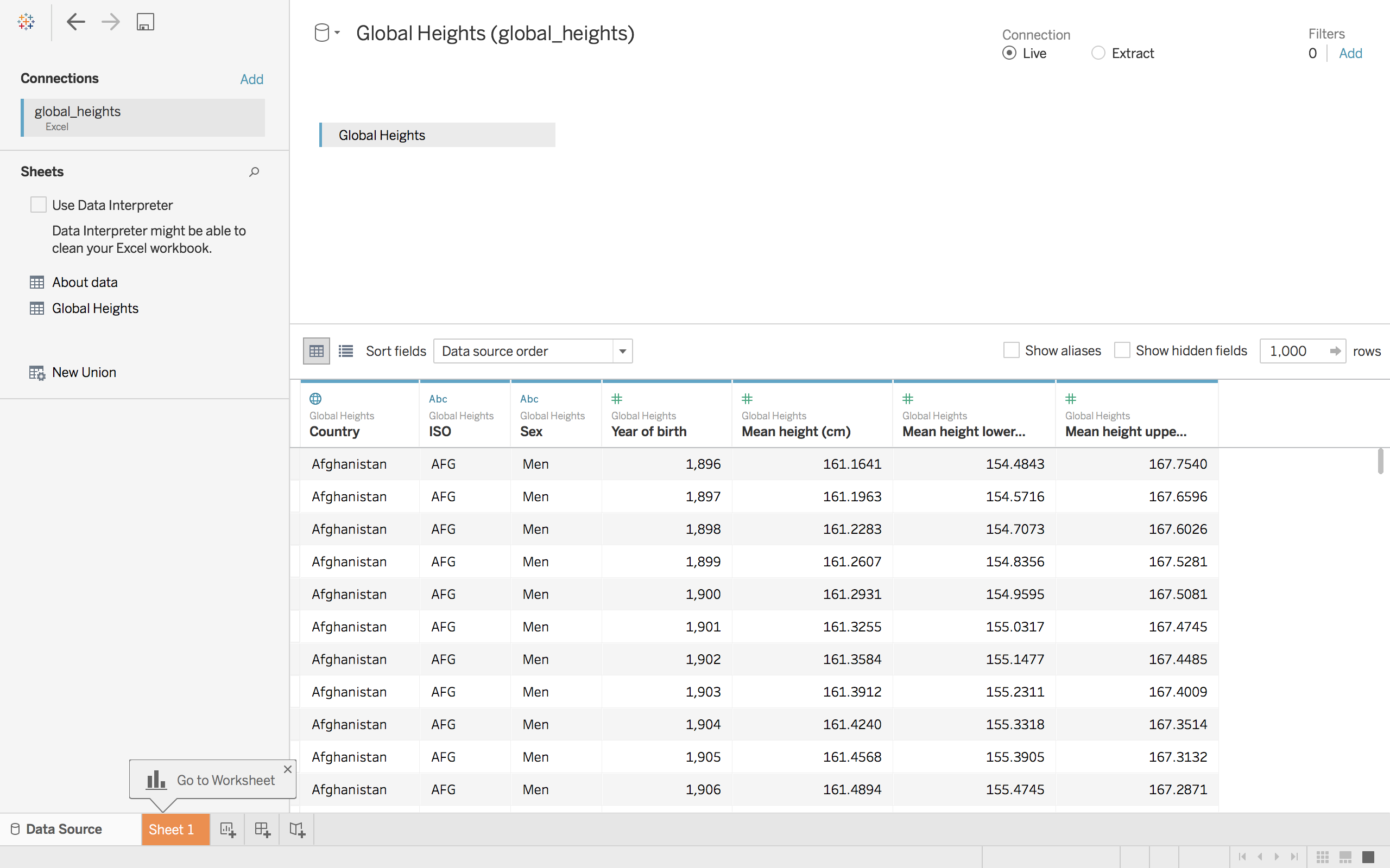
R can give us a quick summary of each field. 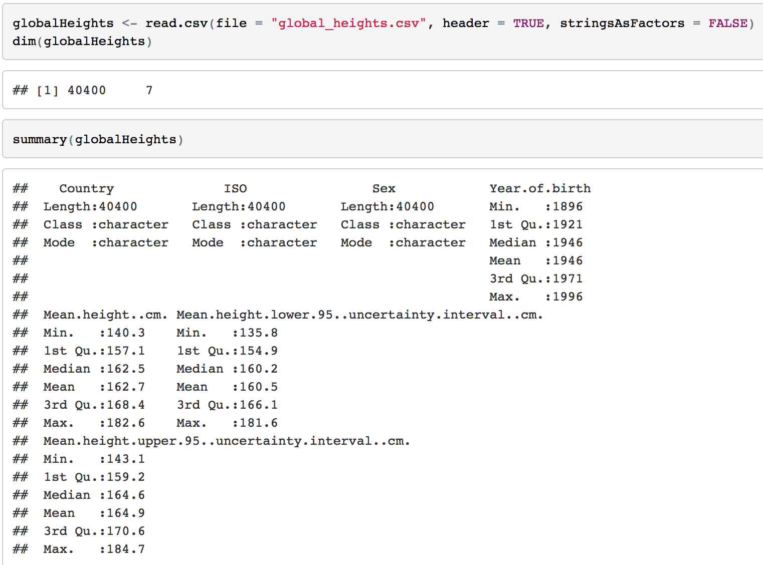 2.1 How many countries are included?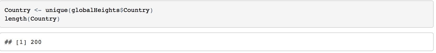 200 countries are included in this dataset. 2.2 The range of Year of birth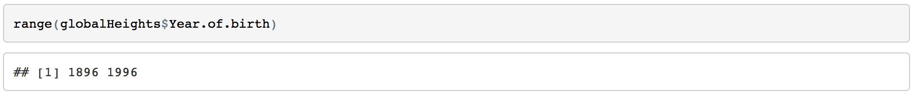 The mean height are come from the people born from 1896 to 1996. So the year of collecting the data is from 1914 to 2014, 101 years. 2.3 Highest Man & Woman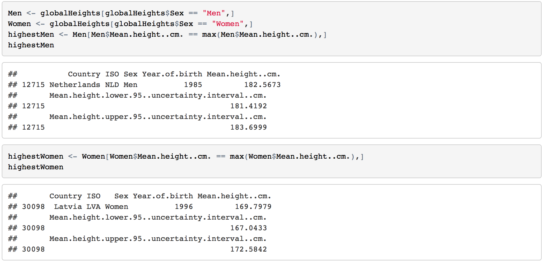 The highest mean height of men is 182.5673 cm from Netherlands born in 1985. For women, it's 169.7979 cm from Latvia. 2.4 Shortest Man & Woman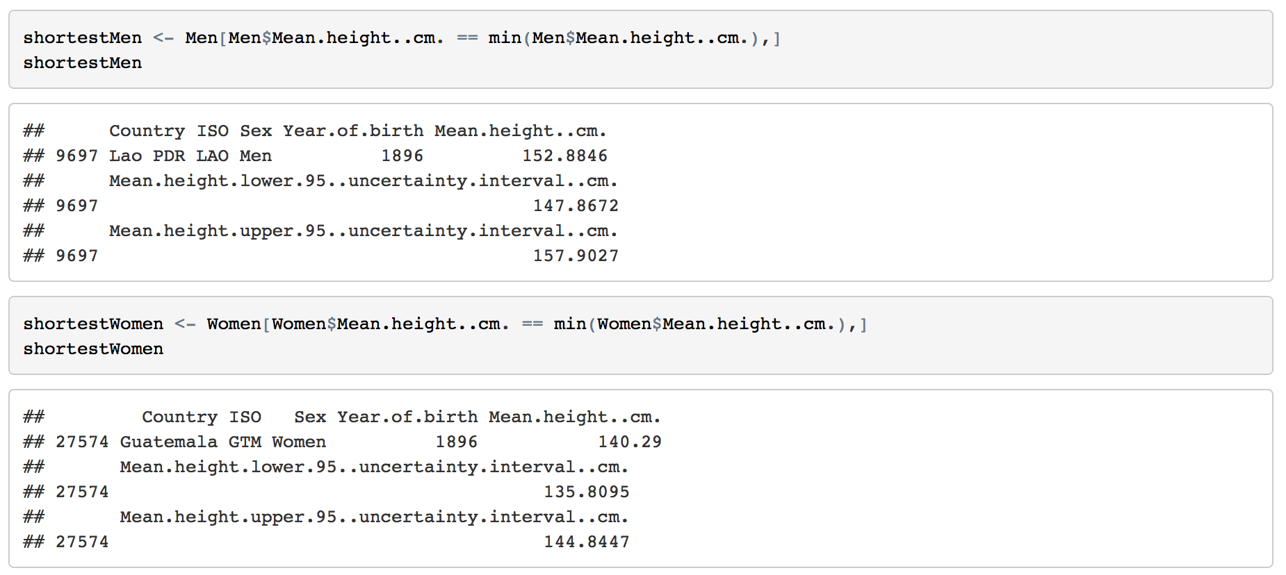 Men from Lao PDR born in 1896 has the lowest mean height, 152.8846 cm. Women from Guatemala born in 1986 are 140.29 cm. 3. Basic Visualizations3.1 Statistics on Maps
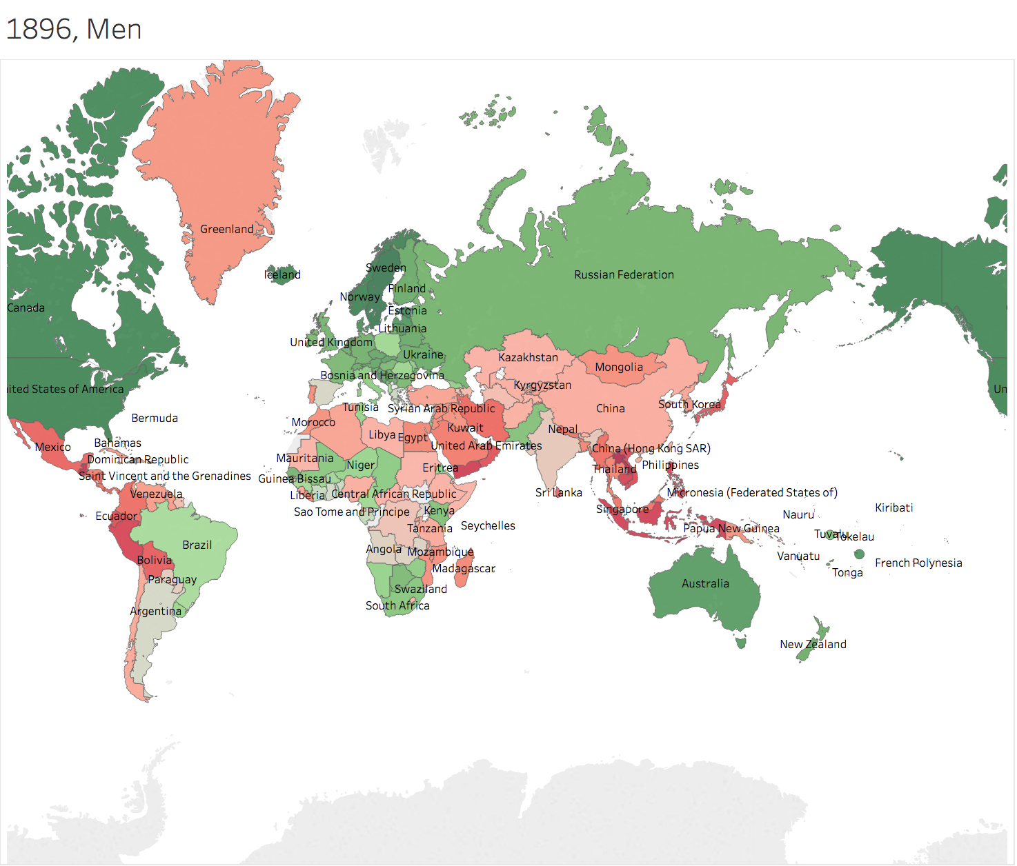
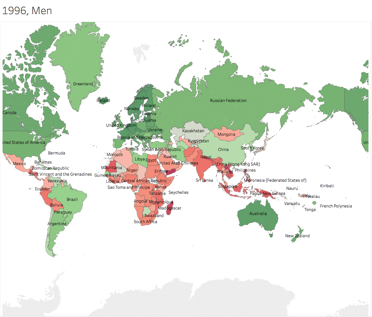
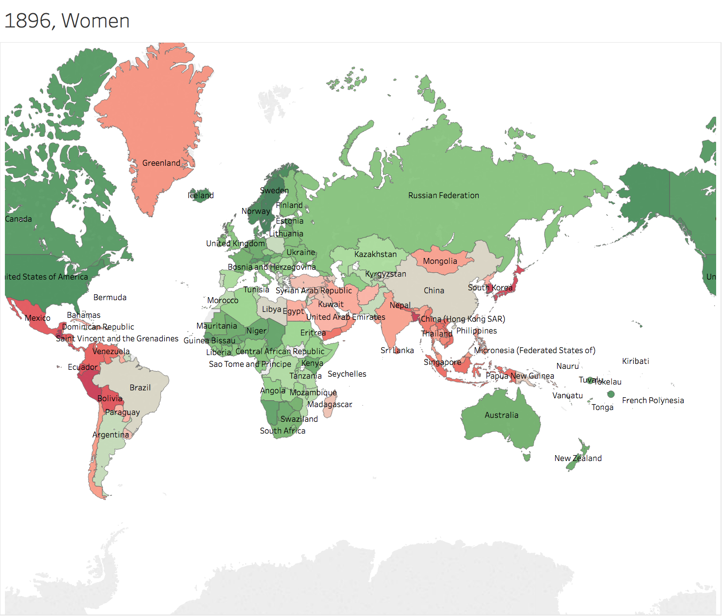
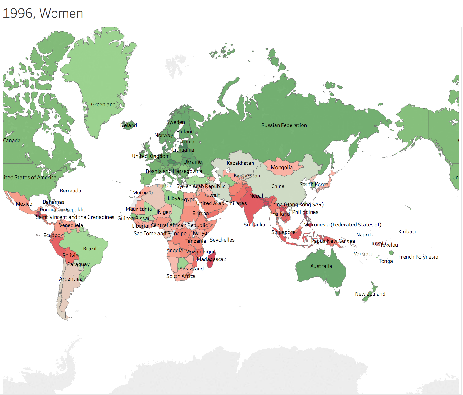 Generally speaking, height of people in Greenland grows faster than others. Men in China and nearby countries has the height more than average of the world 100 years later. However, people in Africa Area seems left behind. 3.2 Trend Lines
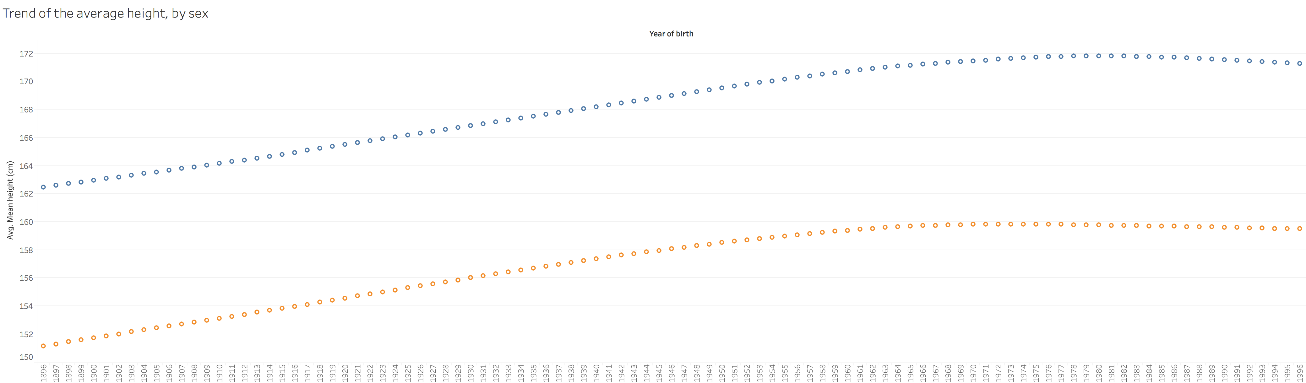 From 1896 to around 1970, there is an obvious increasement of height for the whole world. However, after 1980, there is even a decreasement.
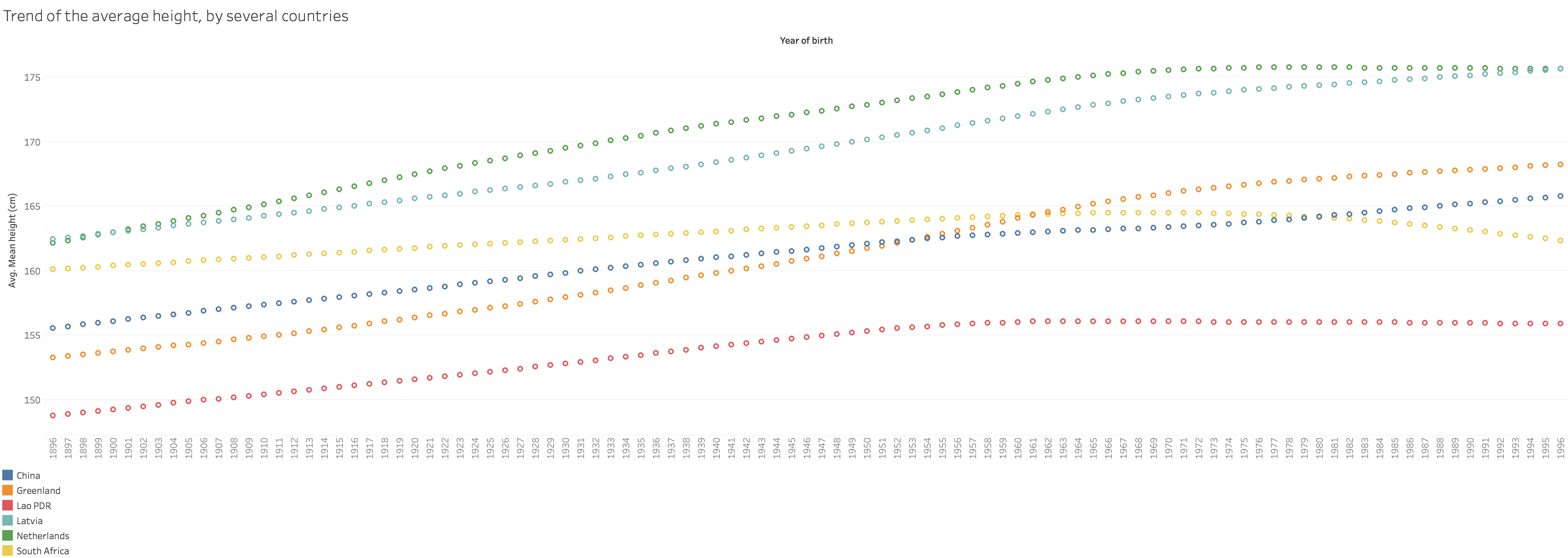 Interesting results and also the questions to consider. 3.3 Make A DashboardTo make dashboards, the thing to consider is what people would like to see with the dashboard. Several points in my mind:
https://public.tableau.com/profile/jiawen.qi#!/vizhome/Book1_15239/GlobalHeight 4. Do a simple linear regression 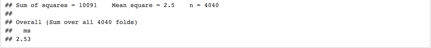 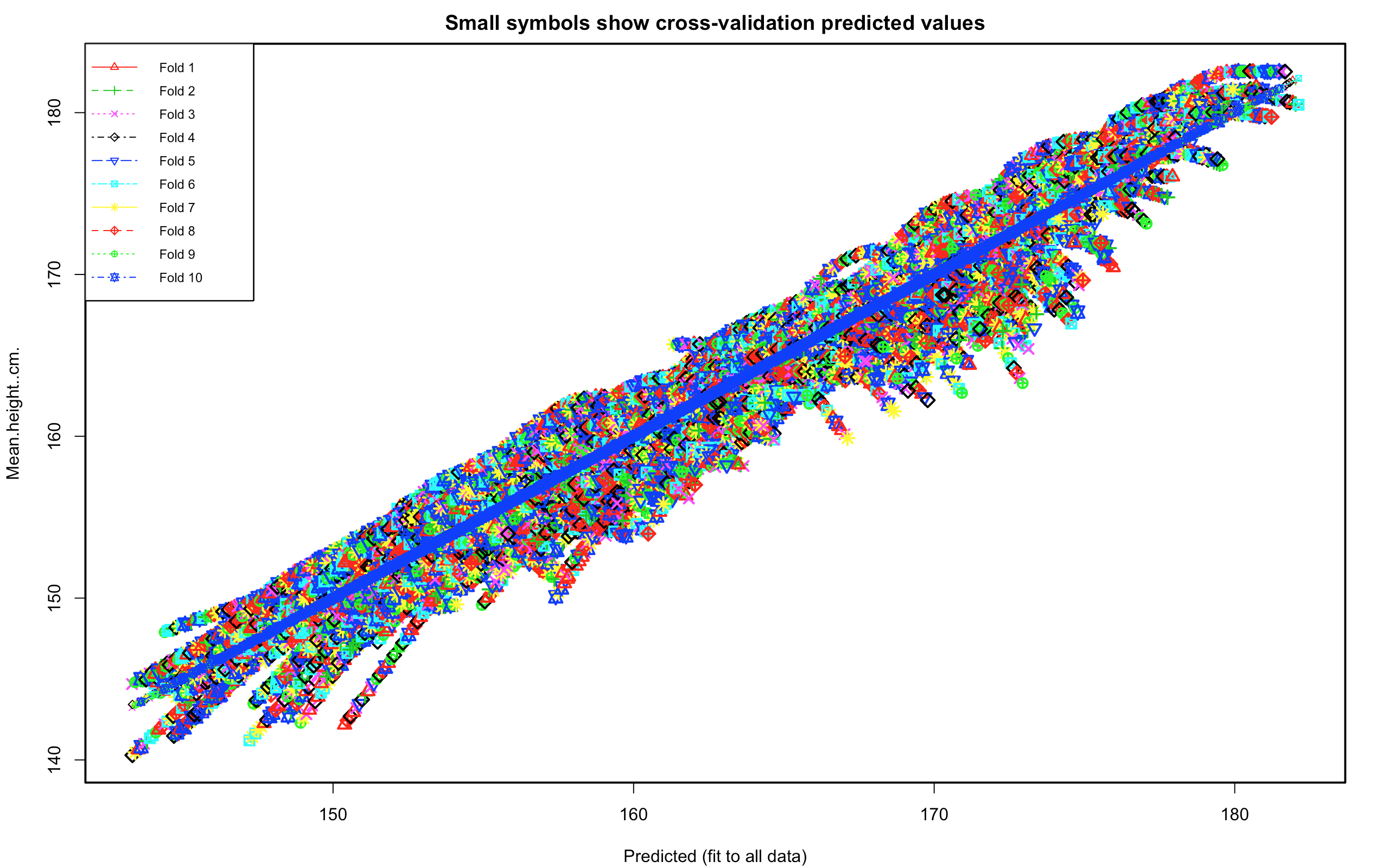 The overall MES is 2.53. The range of height is 140~183. The prediction is not bad.
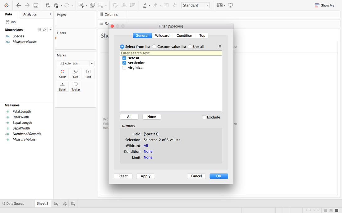
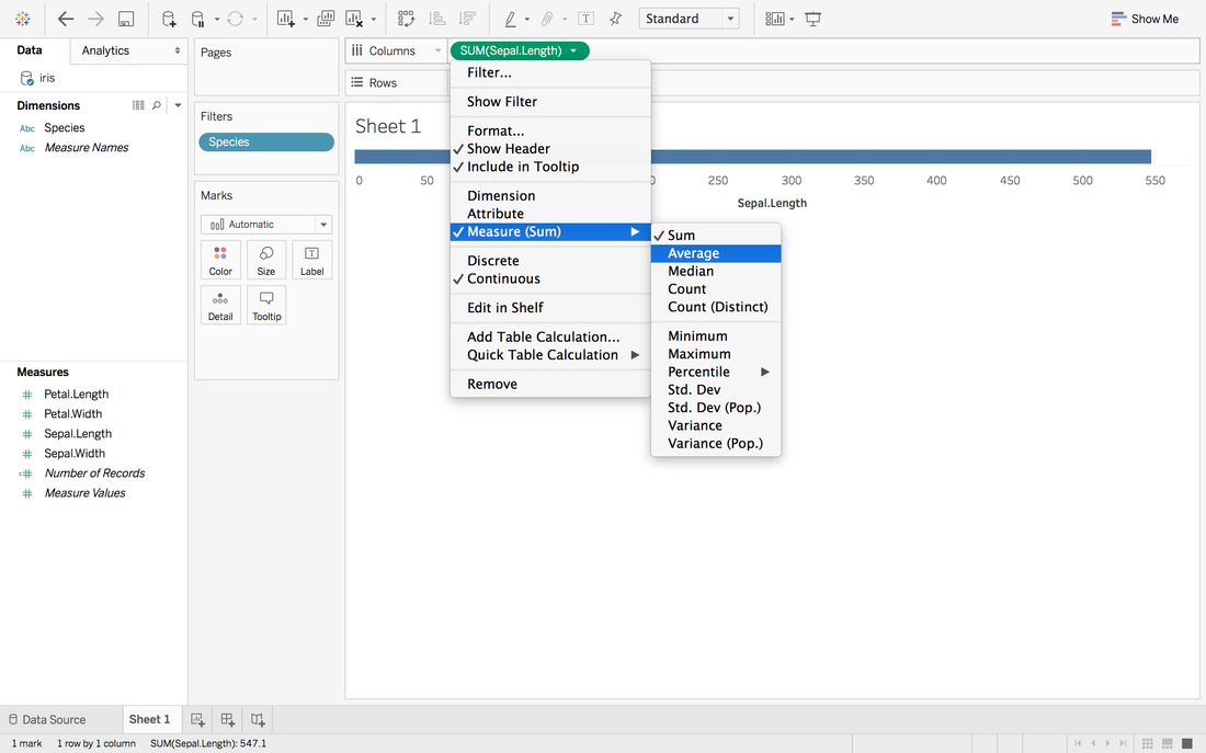
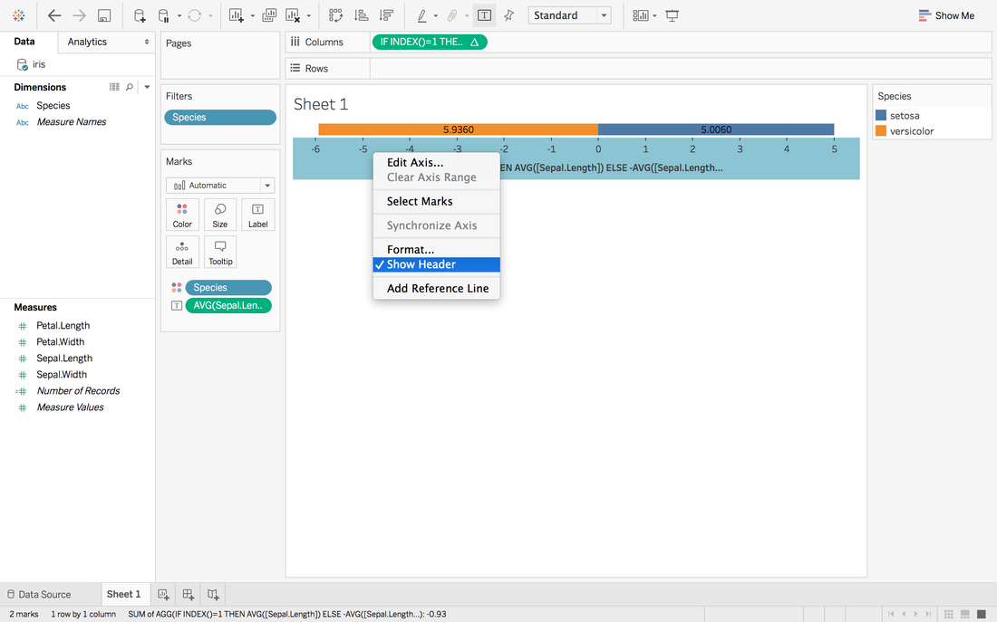
Andy Kriebel posted an article about the tip to create a diverging bar chart with one measure two weeks ago. Simply speaking, diverging bar chart is good at comparing two categories in Tableau. For example, comparing the age, height, weight of Tom and Jerry. This post will use a famous dataset, iris data, to redo the tip step by step. Step 1: Import the data into Tableau 10Data connection is located at the left blue panel. You need to choose text if your iris data is in the csv format. Then find your iris data and click open. 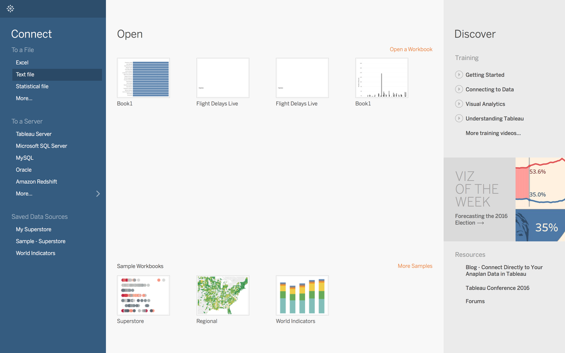 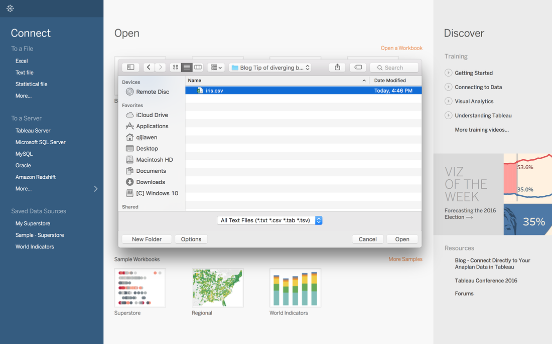 Step 2: Data OverviewAfter clicking the open button in the first step, you will get a general overview of iris dataset. 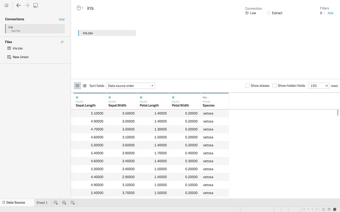 We have one categorical variable: Species and four numeric variables: sepal length, sepal width, petal length and petal width. Species is the variable that we can choose 2 kinds to compare. Step 3: Get your first sheetJust click the Sheet1 at left bottom, you will jump to your first sheet. Let's compare the sepal length of setosa and versicolor to try.
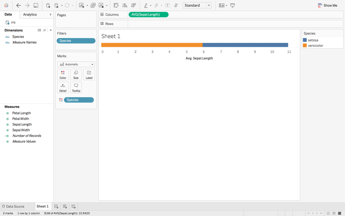 Now, we have a stacked bar chart. But we want the middle to be 0 and left side to be the average sepal length of versicolor and right side to be the sepal length of setosa.
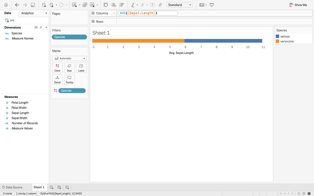
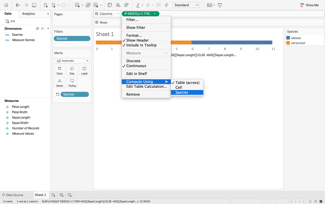 Now, it looks like 0 in the middle and close to our target. 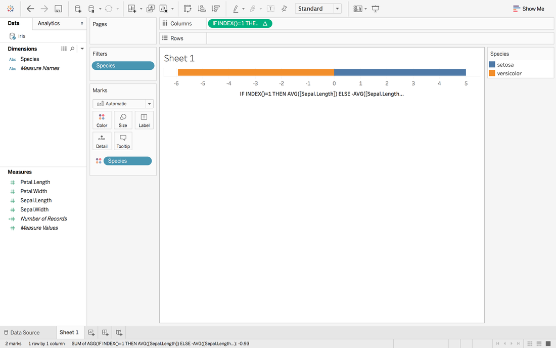
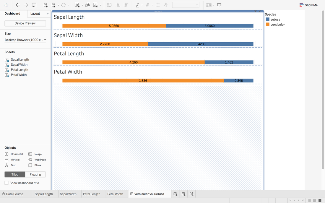
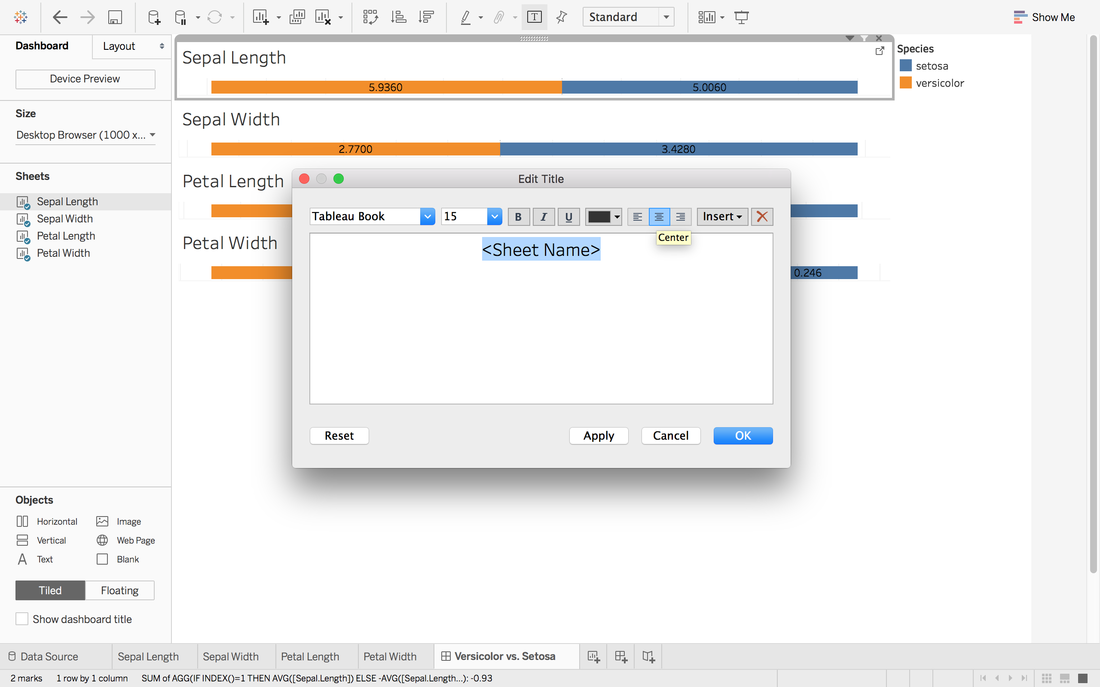
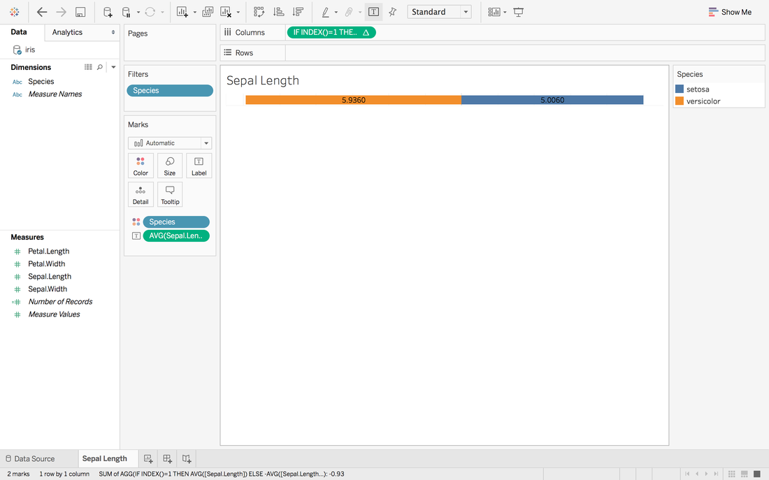 Here we go. The first sheet is created. Step 4: Repeat Step 3 for other measures you want and create a dashboard
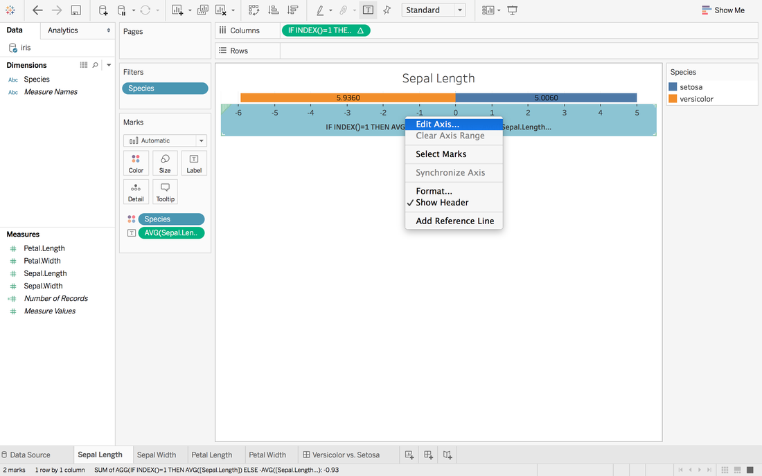
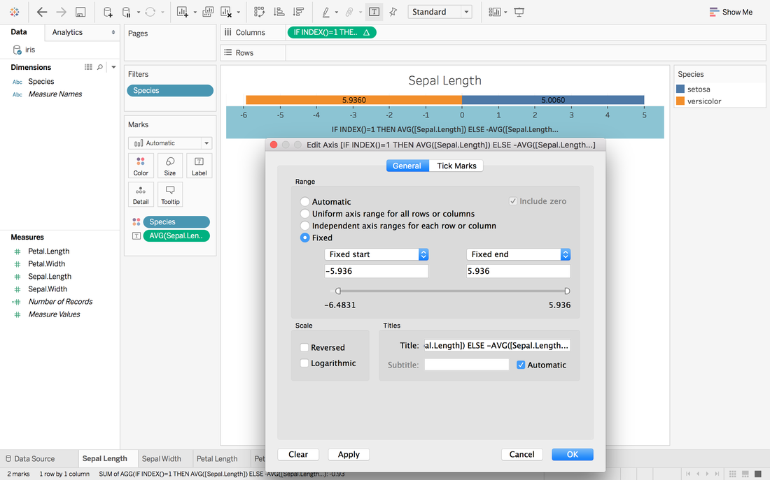
 It looks good but we want the middle to be in the same center.
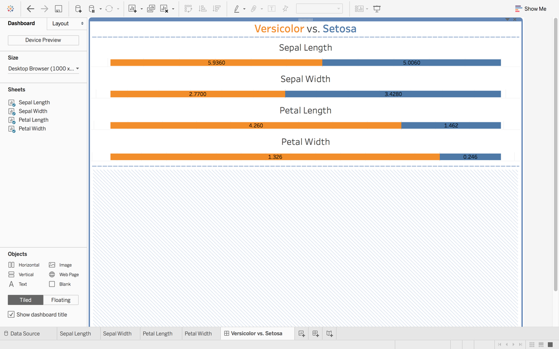 In Andy's post, he didn't give the solution to put all middle into the same center. One way in my mind is:
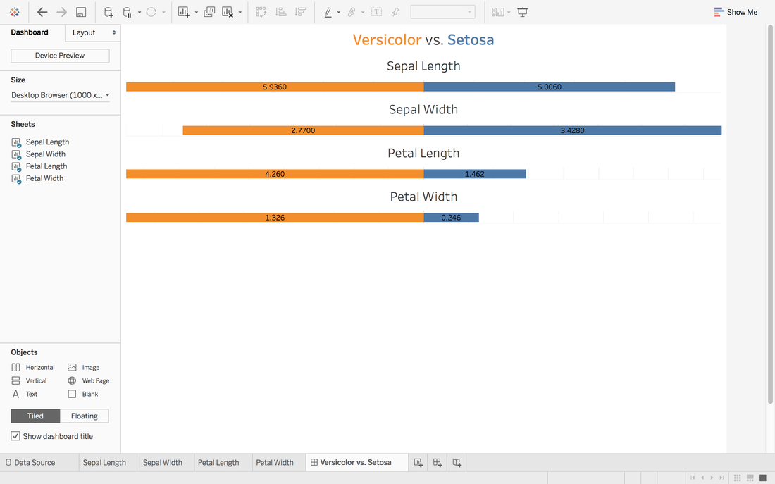 To view this dashboard:
https://public.tableau.com/profile/jiawen.qi#!/vizhome/DivergingBarChart/Versicolorvs_Setosa Tableau 10 was released several weeks ago. The 10 version has more functions like cross-database join and cluster algorithm model. And I believe that San Francisco Crime Dataset is a good dataset to start. San Francisco Crime Dataset was released on Kaggle competition and you can download data here: https://www.kaggle.com/c/sf-crime/data?test.csv.zip This competition was designed to predict the category of crimes that occurred in the city by the bay. Here is the description of this competition: "From 1934 to 1963, San Francisco was infamous for housing some of the world's most notorious criminals on the inescapable island of Alcatraz. Today, the city is known more for its tech scene than its criminal past. But, with rising wealth inequality, housing shortages, and a proliferation of expensive digital toys riding BART to work, there is no scarcity of crime in the city by the bay. From Sunset to SOMA, and Marina to Excelsior, this competition's dataset provides nearly 12 years of crime reports from across all of San Francisco's neighborhoods. Given time and location, you must predict the category of crime that occurred." First, let's look at several lines of this dataset: 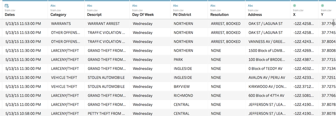 There are 9 variables in the dataset: Dates: timestamp of the crime incident Category: category of the crime incident Descript: detailed description of the crime incident Day Of Week: the day of the week Pd District: name of the Police Department District Resolution: how the crime incident was resolved Address: the approximate street address of the crime incident X: Longitude Y: Latitude 1. Time Series of Crime Records 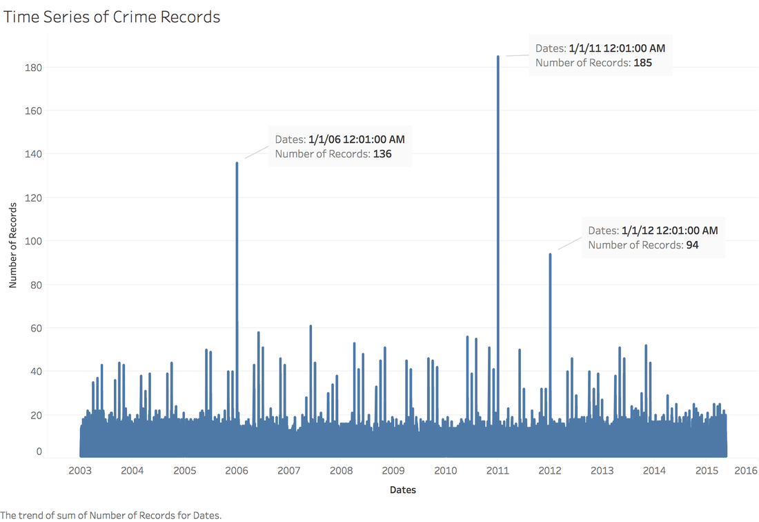 It is interesting to find that the top three peaks are all at the first day of 2006, 2011 and 2012. Which need more thinking is that most of other small peaks from 20 to 60 are always the first day of a month. When sum the crime records for each day of month: 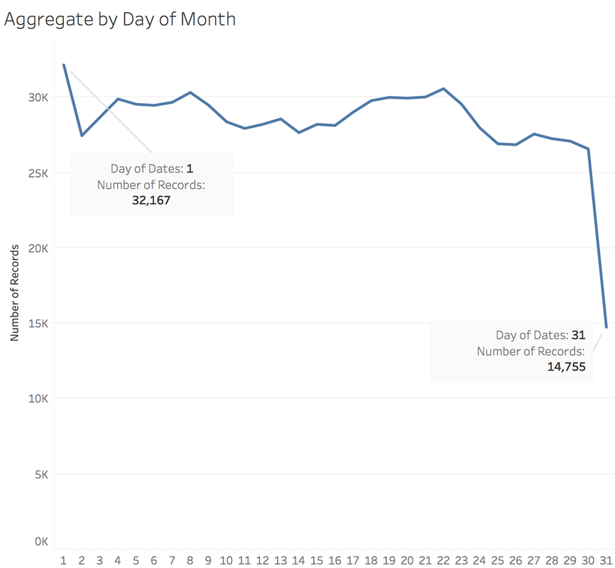 It is easy to understand that the sum of crime records of 31th is almost half of 1st, because not every month has 31th. Let's pick out the records in 1st and check the categories. 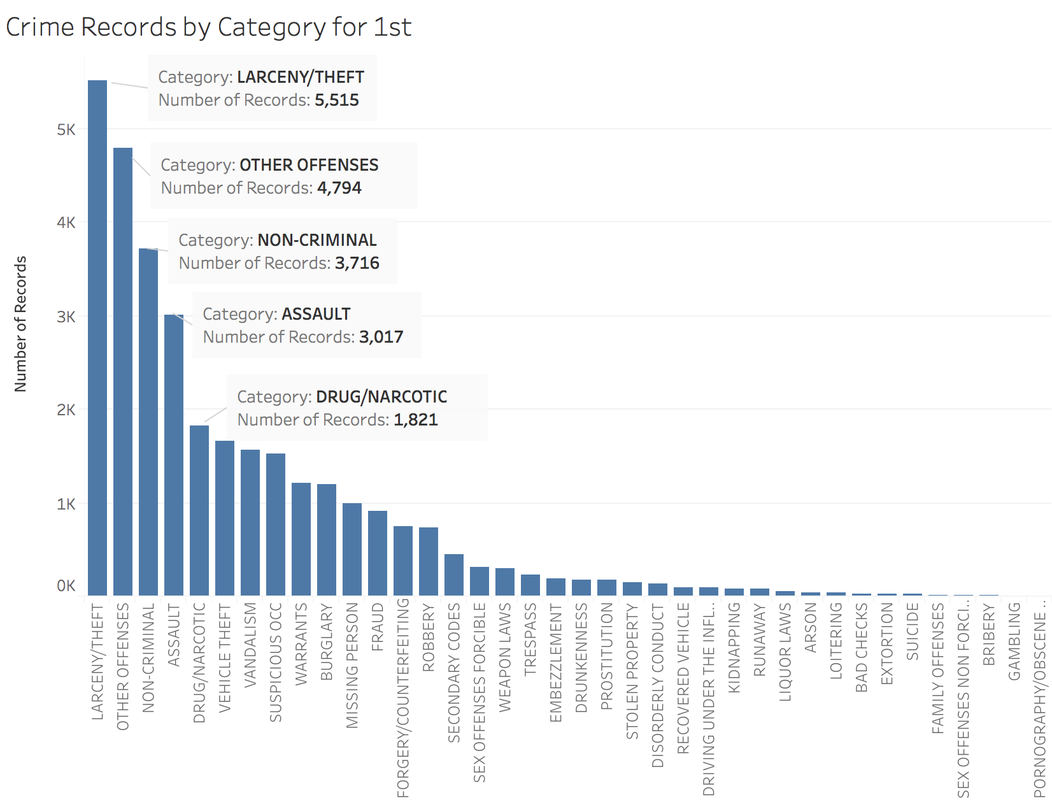 The top 5 categories of crime incidents are LARCENY/THEFT, OTHER OFFENSES, NON-CRIMINAL, ASSAULT and DRUG/NARCOTIC. 2. Where did crime happen? With x and y variable in dataset, we can map the data. 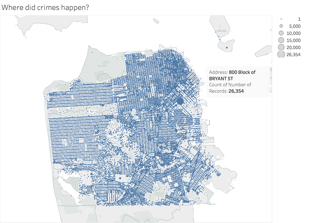 It is very clear and interesting to see the places of crime happened follow the streets pattern. I use records to size of circle and find that 800 Block of Bryant St. is a place that has 26,354 crime incidents during 2003 to 2015. Then remove the spots that have less than 1000 crimes during 12 years. 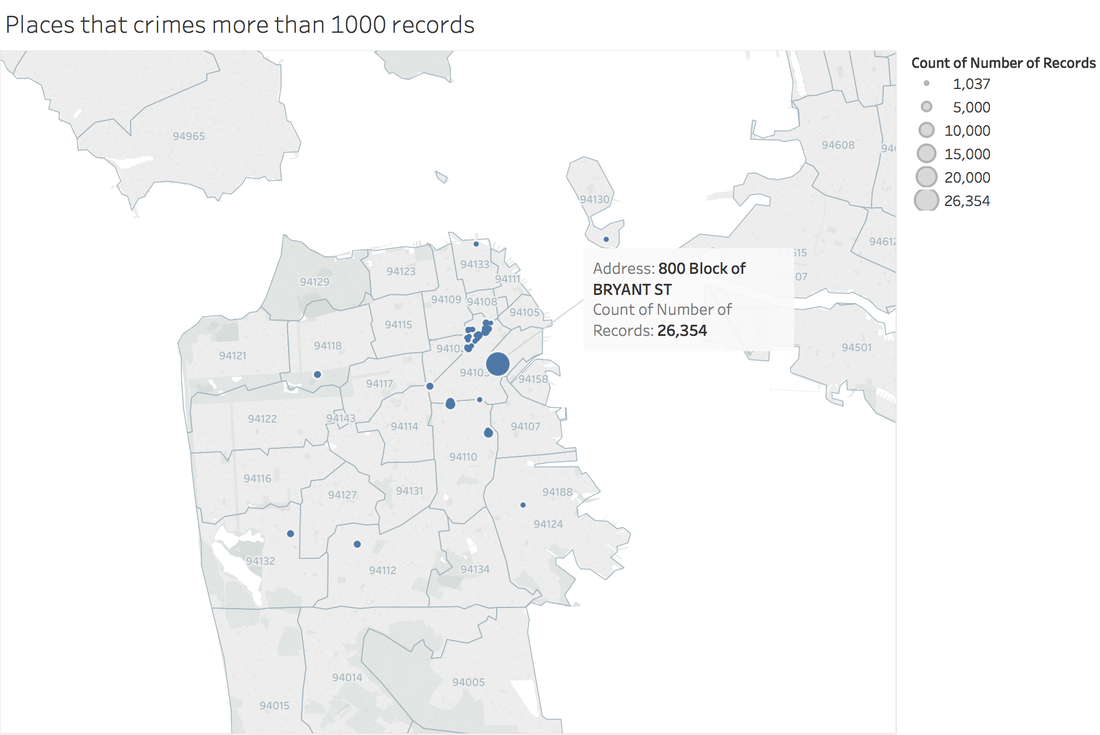 Can I conclude that the south east of San Francisco Bay Area is more dangerous? Then let's see the category of crimes for 800 Block of BRYANT ST. 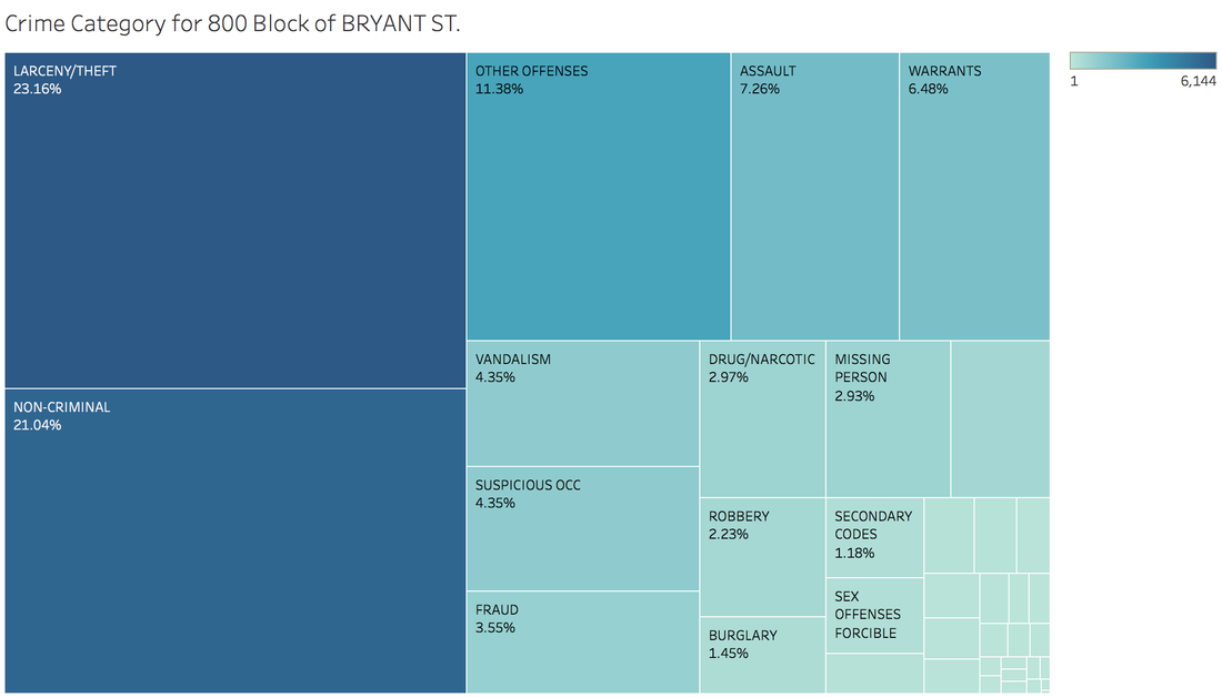 When adding the Police Department Districts to map: 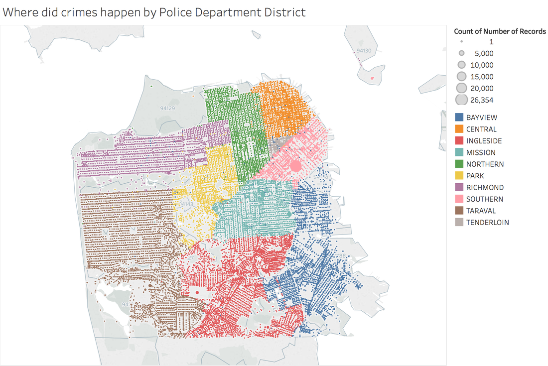 3. How did crime incidents resolved? 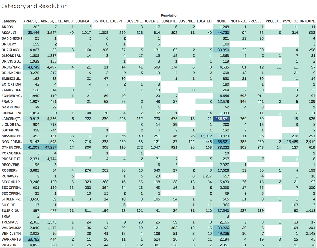 Other than ARREST resolution, most of the crime incidents were under the NONE resolution, which is understandable and disappointed. 4. Create a dashborad 
Rossmann Store Sales is a Kaggle Competition. You can find information about this dataset and download it here : https://www.kaggle.com/c/rossmann-store-sales/data
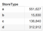
The purpose of this competition was to predict sales using store, promotion, and competitor data. Here is some information of this competition from the Kaggle Website: "Rossmann operates over 3,000 drug stores in 7 European countries. Currently, Rossmann store managers are tasked with predicting their daily sales for up to six weeks in advance. Store sales are influenced by many factors, including promotions, competition, school and state holidays, seasonality, and locality. With thousands of individual managers predicting sales based on their unique circumstances, the accuracy of results can be quite varied.In their first Kaggle competition, Rossmann is challenging you to predict 6 weeks of daily sales for 1,115 stores located across Germany. Reliable sales forecasts enable store managers to create effective staff schedules that increase productivity and motivation. By helping Rossmann create a robust prediction model, you will help store managers stay focused on what’s most important to them: their customers and their teams! " 1. Understand this dataset There are four csv files in this dataset: store.csv, train.csv, test.csv and sample_submission.csv. In the first step, we just need to look into store and train files. Store file contains the supplemental information about stores. Train file contains the historical data including Sales. ## Load store file store <- read.csv("store.csv", header = TRUE, stringsAsFactors = FALSE) ## Get the dimension of store file dim(store) ## [1] 1115 10 ## Get the summary of store file summary(store) ## Store StoreType Assortment ## Min. : 1.0 Length:1115 Length:1115 ## 1st Qu.: 279.5 Class :character Class :character ## Median : 558.0 Mode :character Mode :character ## Mean : 558.0 ## 3rd Qu.: 836.5 ## Max. :1115.0 ## ## CompetitionDistance CompetitionOpenSinceMonth CompetitionOpenSinceYear ## Min. : 20.0 Min. : 1.000 Min. :1900 ## 1st Qu.: 717.5 1st Qu.: 4.000 1st Qu.:2006 ## Median : 2325.0 Median : 8.000 Median :2010 ## Mean : 5404.9 Mean : 7.225 Mean :2009 ## 3rd Qu.: 6882.5 3rd Qu.:10.000 3rd Qu.:2013 ## Max. :75860.0 Max. :12.000 Max. :2015 ## NA's :3 NA's :354 NA's :354 ## Promo2 Promo2SinceWeek Promo2SinceYear PromoInterval ## Min. :0.0000 Min. : 1.0 Min. :2009 Length:1115 ## 1st Qu.:0.0000 1st Qu.:13.0 1st Qu.:2011 Class :character ## Median :1.0000 Median :22.0 Median :2012 Mode :character ## Mean :0.5121 Mean :23.6 Mean :2012 ## 3rd Qu.:1.0000 3rd Qu.:37.0 3rd Qu.:2013 ## Max. :1.0000 Max. :50.0 Max. :2015 ## NA's :544 NA's :544
The store file has 1,115 observations and 10 fields.
From competition website we can find data fields descriptions:
## Load the train file
train <- read.csv("train.csv", header = TRUE, stringsAsFactors = FALSE)
## Get the dimension of train file
dim(train)
## [1] 1017209 9 ## Get the summary of train file summary(train) ## Store DayOfWeek Date Sales ## Min. : 1.0 Min. :1.000 Length:1017209 Min. : 0 ## 1st Qu.: 280.0 1st Qu.:2.000 Class :character 1st Qu.: 3727 ## Median : 558.0 Median :4.000 Mode :character Median : 5744 ## Mean : 558.4 Mean :3.998 Mean : 5774 ## 3rd Qu.: 838.0 3rd Qu.:6.000 3rd Qu.: 7856 ## Max. :1115.0 Max. :7.000 Max. :41551 ## Customers Open Promo StateHoliday ## Min. : 0.0 Min. :0.0000 Min. :0.0000 Length:1017209 ## 1st Qu.: 405.0 1st Qu.:1.0000 1st Qu.:0.0000 Class :character ## Median : 609.0 Median :1.0000 Median :0.0000 Mode :character ## Mean : 633.1 Mean :0.8301 Mean :0.3815 ## 3rd Qu.: 837.0 3rd Qu.:1.0000 3rd Qu.:1.0000 ## Max. :7388.0 Max. :1.0000 Max. :1.0000 ## SchoolHoliday ## Min. :0.0000 ## 1st Qu.:0.0000 ## Median :0.0000 ## Mean :0.1786 ## 3rd Qu.:0.0000 ## Max. :1.0000
In the train file, there are 1,017,209 observations and 9 data fields.
2. Exploration and Visualization 2.1 Load Data in Tableau Choose Text File -> Select train.csv -> Drag store.csv to join with train.csv -> Edit the join type into "Left join". 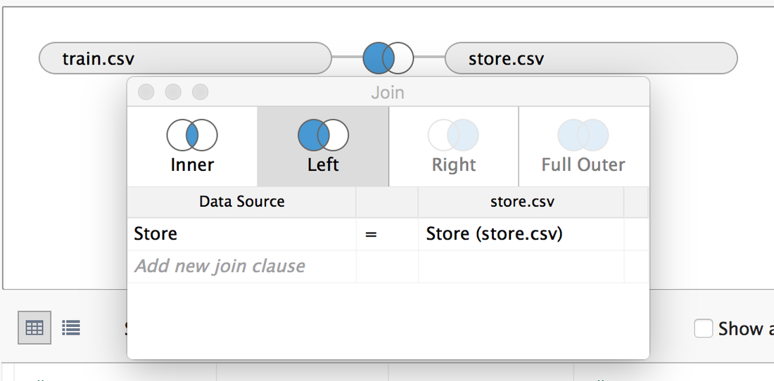
2.2 Ask Questions and Answer them Q1: Which Store has the highest Sales? A1: According to the Store file, there are 111,5 stores. We can use bar chart to show. (Sum the sales and sort by descending order, keep only top 10 stores). The top 1 is store 262. 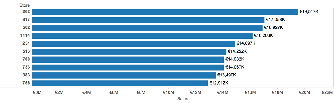
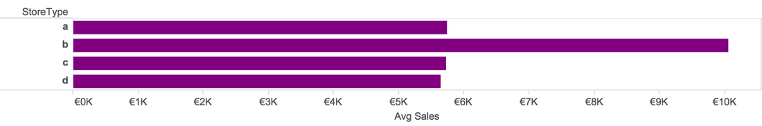
Q2: Which Store Type has the highest Sales
A2: Type a has the highest sum Sales, but type b has the highest average Sales, the reason is in near 1 million dataset, there are only around 15 thousand observations that belong to type b. 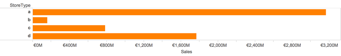
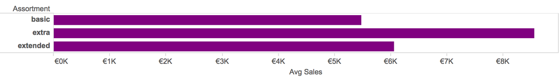
Q3: Which Store Assortment has the highest Sales
A3: Basic store has the highest total sales, but extra stores has the highest average sales. The same reason as store type. 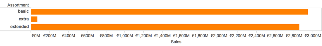
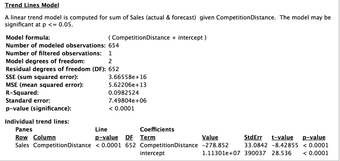
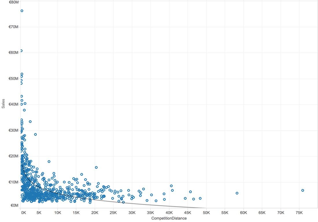
Q4: Is there a possible relation between competitor distance and the sales?
A4: When use scatterplot, we can analysis by trend line. When try linear trend line: 
When try Logarithmic trend line:
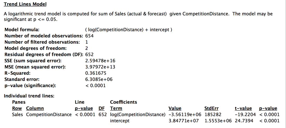
In general, higher R-Squared value means better model. So, there is a logarithmic relation between competition distance and sales.
Q5: Which Day of the week have higher sales? A5: The surprising is that people shopped much much more less on Sundays. 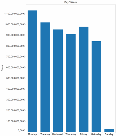
Q6: Did the Date Influence Sales?
A6: When aggregate data by week, the 51st week has higher sales than others. This might because in the end of a year, people need to buy some gifts for families or need to prepare for the new year, also the Christmas. 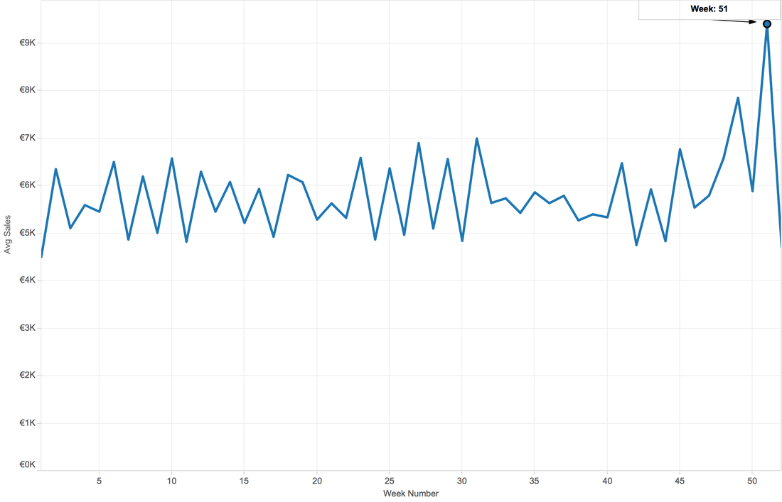
When Aggregate by Month, the first peak appears on Mar, second July, then December. My guess is, spring break, summer vacation and winter vacation, also the Christmas and new year.
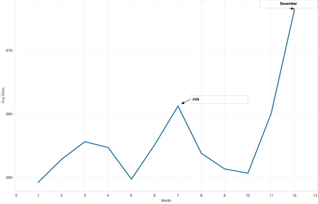
Tableau is clever. This software can do prediction, although we don't know the background algorithm.
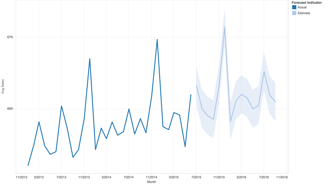
Q7: Till now, we are curious about the sales, sales, and sales...anything else?
A7: How about the people's ability of consumption? We have total sales of a given day, we have customer numbers of a given day. So, can we create a new attribute, consumption ability = sales/customers. And, from the line graph, people's ability of consumption is increasing by year fluctuating in each year. 
In order to let you interactive with the dataset, here is a dashboard:
https://public.tableau.com/views/RossmannStoreSales/Dashboard1?:embed=y&:display_count=yes |
Archive
February 2017
Category |
 RSS Feed
