|
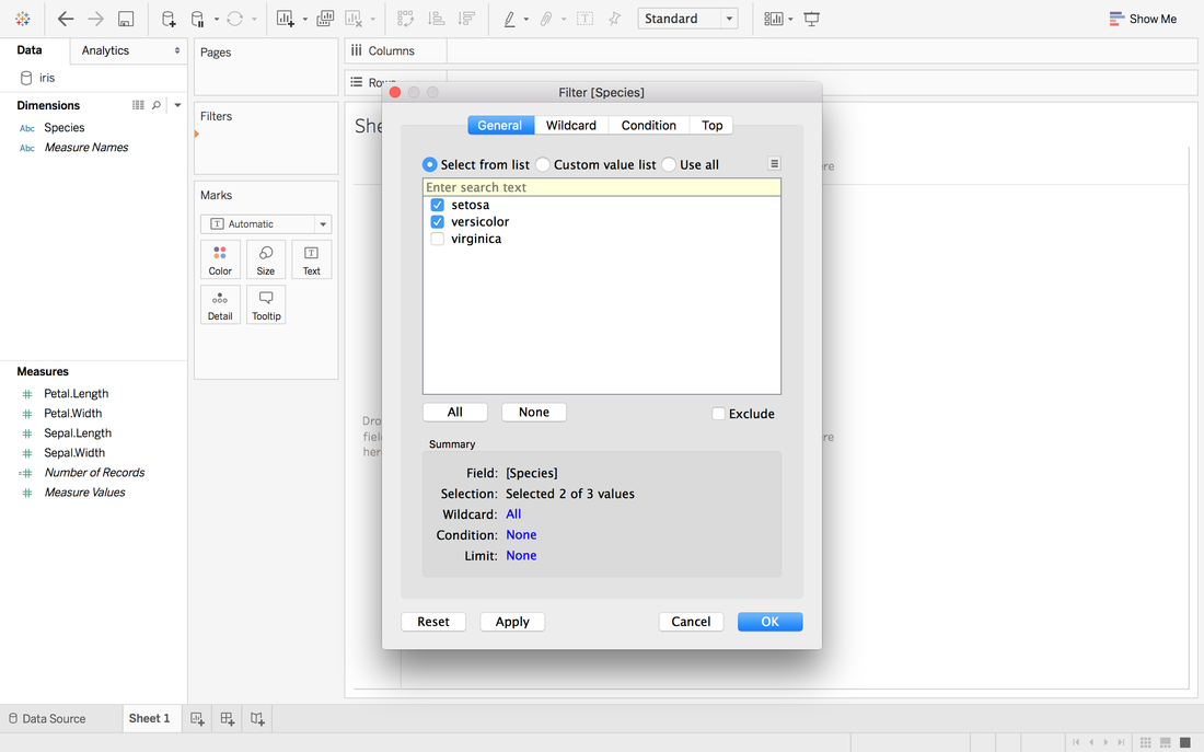
Andy Kriebel posted an article about the tip to create a diverging bar chart with one measure two weeks ago. Simply speaking, diverging bar chart is good at comparing two categories in Tableau. For example, comparing the age, height, weight of Tom and Jerry. This post will use a famous dataset, iris data, to redo the tip step by step. Step 1: Import the data into Tableau 10Data connection is located at the left blue panel. You need to choose text if your iris data is in the csv format. Then find your iris data and click open.  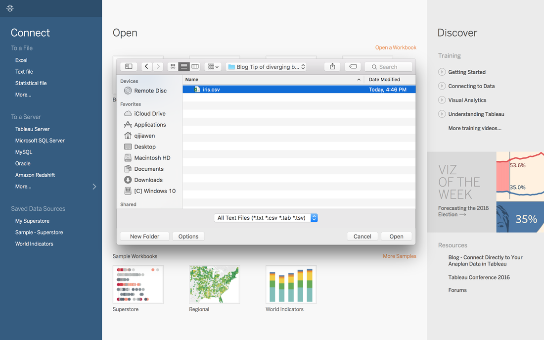 Step 2: Data OverviewAfter clicking the open button in the first step, you will get a general overview of iris dataset. 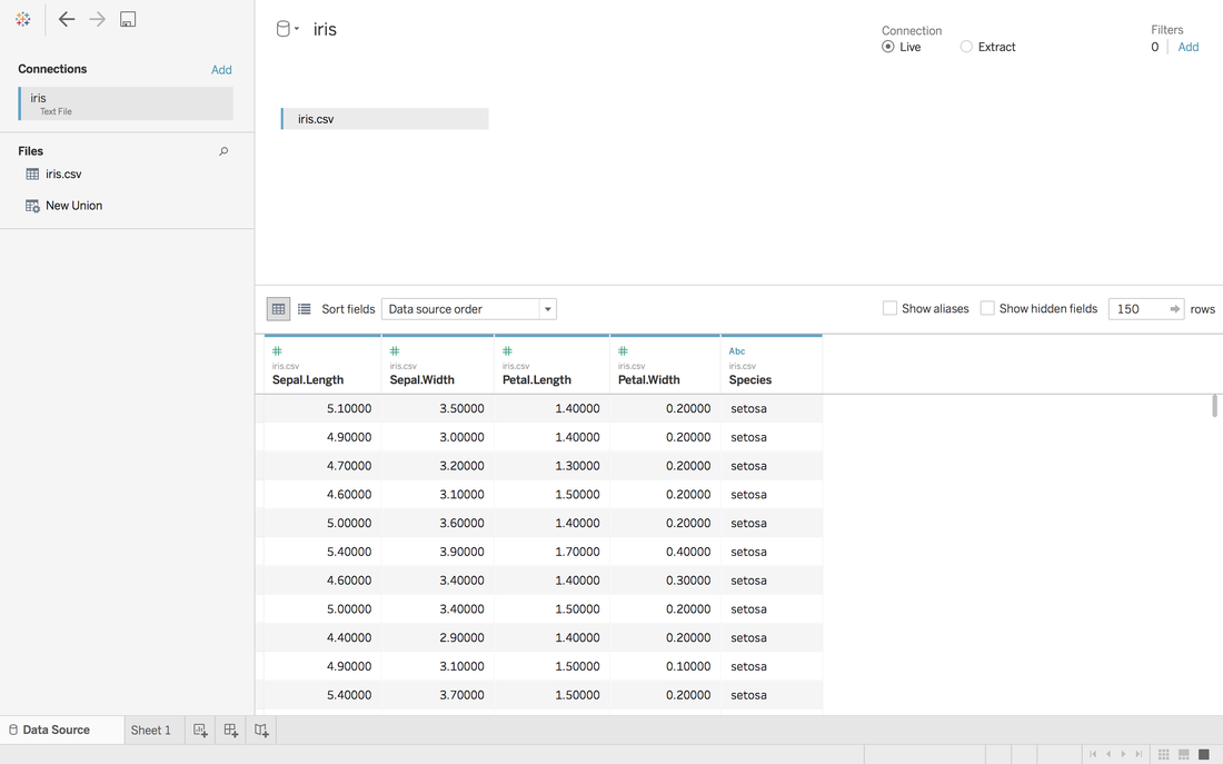 We have one categorical variable: Species and four numeric variables: sepal length, sepal width, petal length and petal width. Species is the variable that we can choose 2 kinds to compare. Step 3: Get your first sheetJust click the Sheet1 at left bottom, you will jump to your first sheet. Let's compare the sepal length of setosa and versicolor to try.
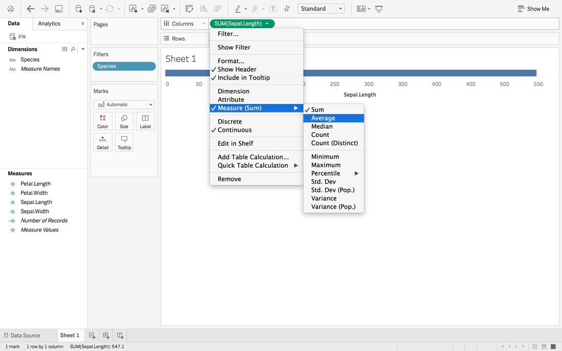
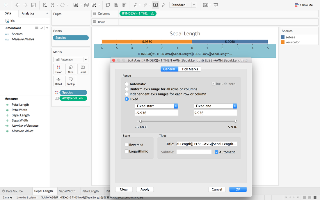
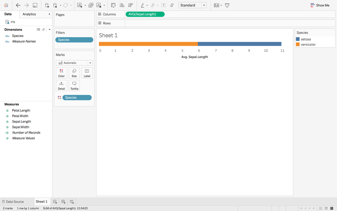 Now, we have a stacked bar chart. But we want the middle to be 0 and left side to be the average sepal length of versicolor and right side to be the sepal length of setosa.
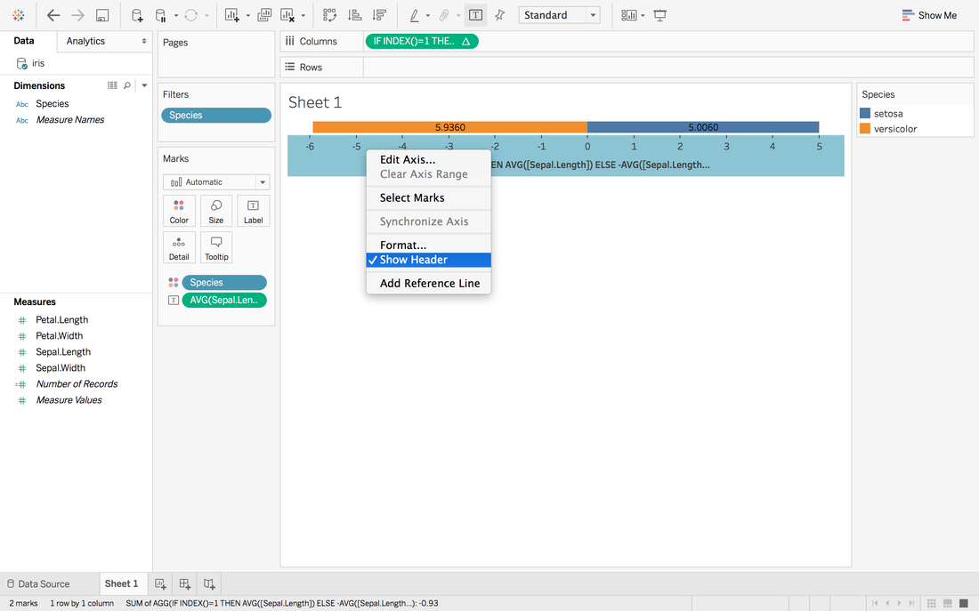
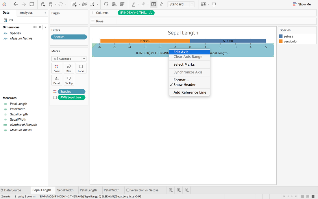
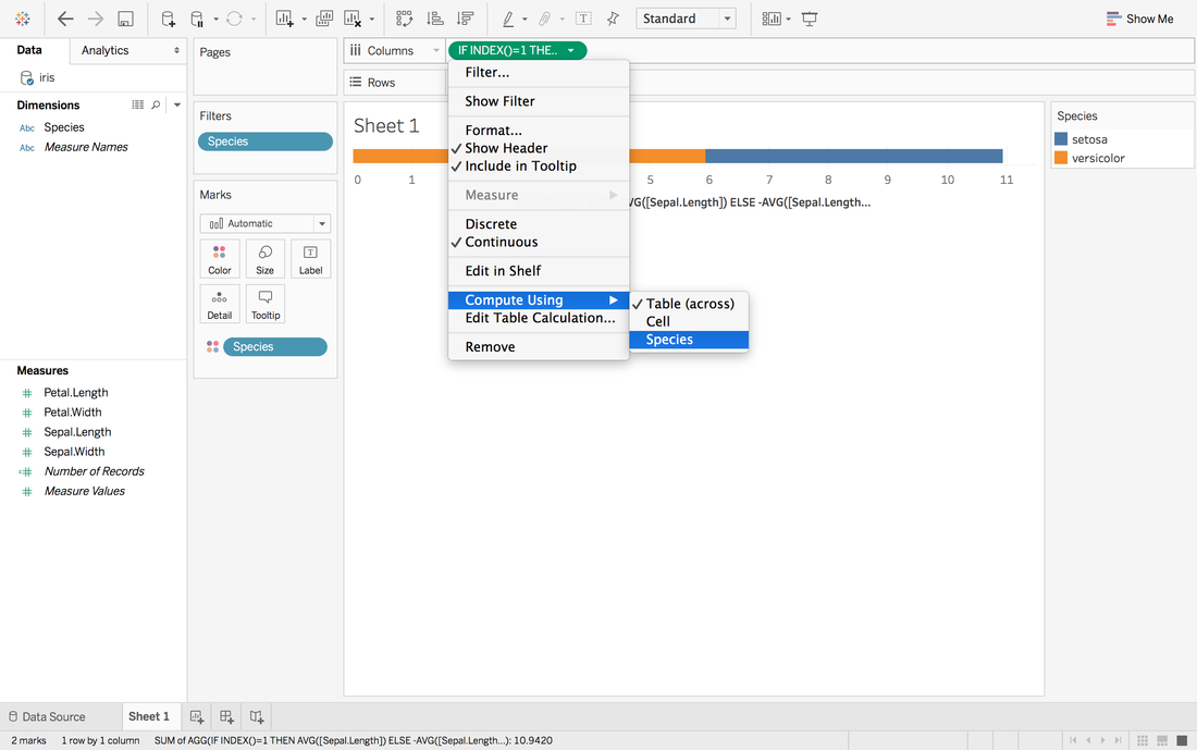 Now, it looks like 0 in the middle and close to our target. 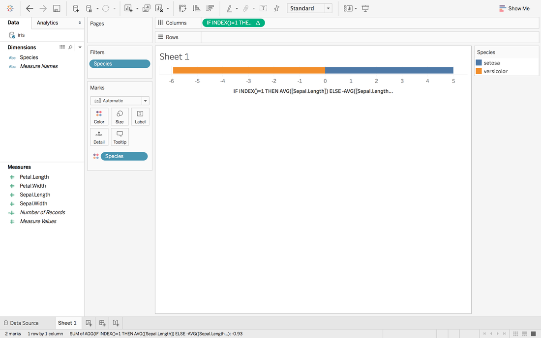
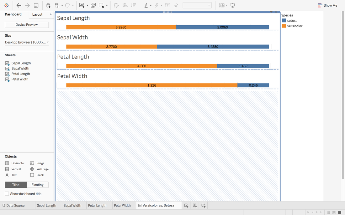
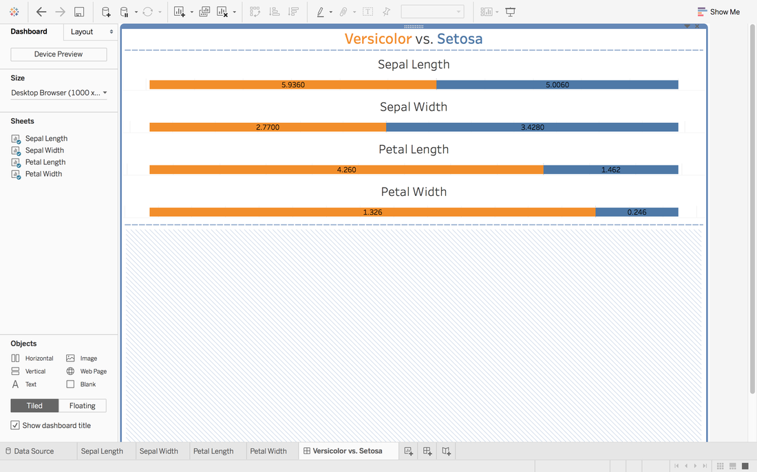
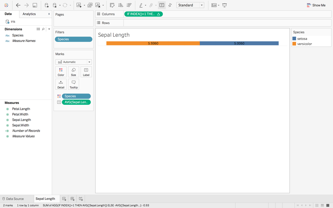 Here we go. The first sheet is created. Step 4: Repeat Step 3 for other measures you want and create a dashboard
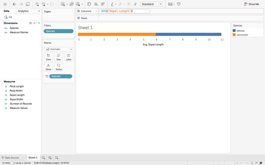
 It looks good but we want the middle to be in the same center.
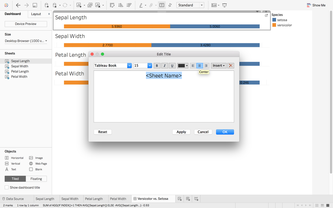
 In Andy's post, he didn't give the solution to put all middle into the same center. One way in my mind is:
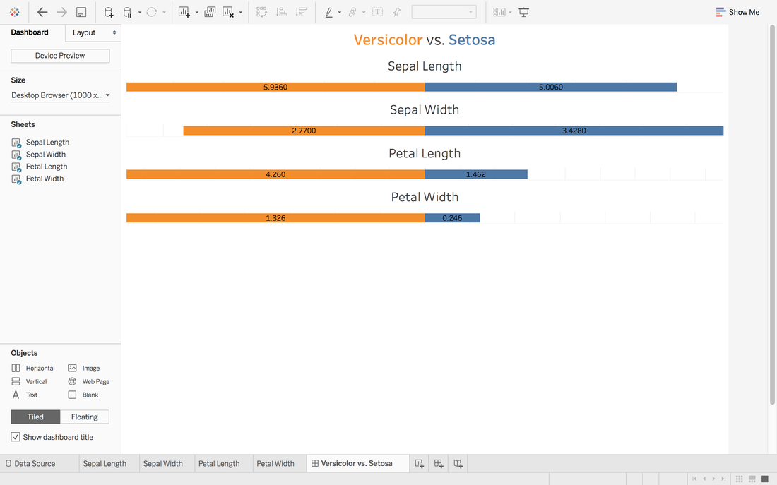 To view this dashboard:
https://public.tableau.com/profile/jiawen.qi#!/vizhome/DivergingBarChart/Versicolorvs_Setosa
0 Comments
|
Archive
February 2017
Category |
 RSS Feed
